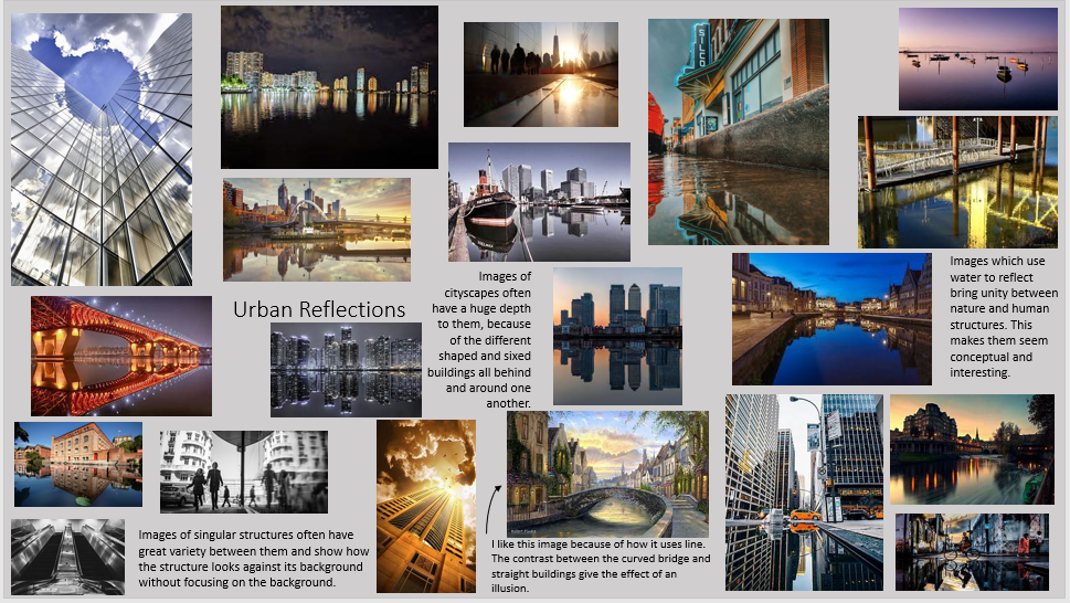
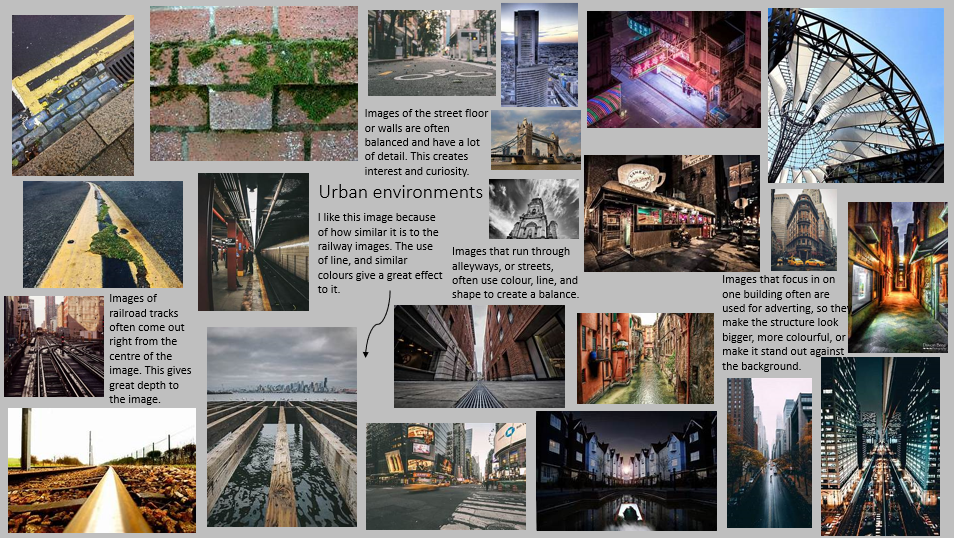
Urban Environments

An urban area is as region surrounding a city. Most inhabitants of urban areas have non-agricultural jobs. Urban areas are very developed, meaning that there is a density of human structures such as houses, commercial buildings, roads, bridges, and railways. ''Urban area'' can refer to towns, cities, and suburbs.
|
Each of us-adult or child-must earn nature's gift by knowing nature directly, however difficult it may be to glean that knowledge in an urban environment. City life is millions of people being lonesome together. We are in danger of making our cities places where business goes on but where life, in its real sense, is lost. |
Initial Research
Shoot Plan / Urban Landscapes
I was inspired by the most recent shoots I have done, abstract nature. This was because it showed how the lighting and shadows within an image impact on the look of the environment. I will complete this shoot outdoors, at around 12pm, because I plan to do a landscape shoot and will need the good lighting from the sun, high key. This shoot will be/ was in Preston, and props are limited due to the shoot being taken in public.
I will likely adjust the white balance on my images to address the uncontrollable natural lighting used. The camera used will be a Sony A2000, with a kit and telephoto lens. I intend to use a smaller aperture, f/1, for a large depth of field in my Urban Landscape images. I used auto focus, to ensure that each image looked similar, and was focused in the same way. I was not inspired by any artists, as I have not studied any so far, but in later shoots I plan to emulate Tom Manley's work. below is some of Manley's work. I love images which show buildings against the sky, as the contrast between the browns and greys, and the blues and whites is almost always huge.
I will likely adjust the white balance on my images to address the uncontrollable natural lighting used. The camera used will be a Sony A2000, with a kit and telephoto lens. I intend to use a smaller aperture, f/1, for a large depth of field in my Urban Landscape images. I used auto focus, to ensure that each image looked similar, and was focused in the same way. I was not inspired by any artists, as I have not studied any so far, but in later shoots I plan to emulate Tom Manley's work. below is some of Manley's work. I love images which show buildings against the sky, as the contrast between the browns and greys, and the blues and whites is almost always huge.
|
|
|
Best edited images/ urban environments
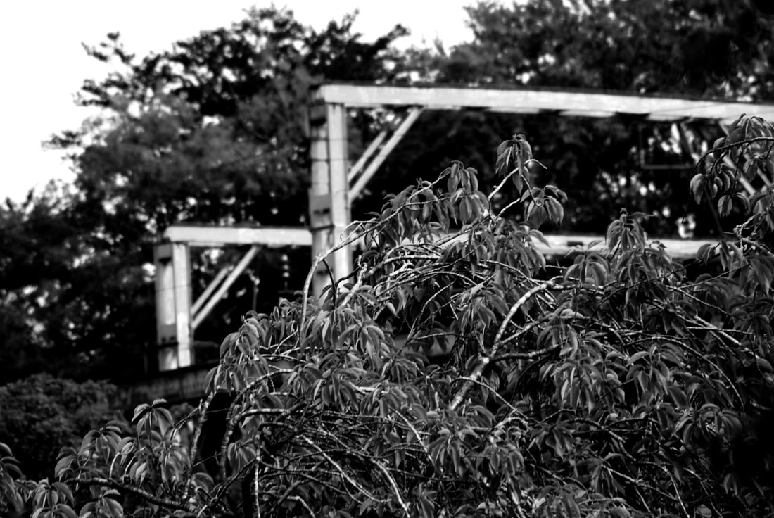
In this image, I like how nature and humans are combined, by the train track surrounded by the tops of trees. It could be improved by being slightly more in focus. I would also change the black and white balance, to add a little more brightness.
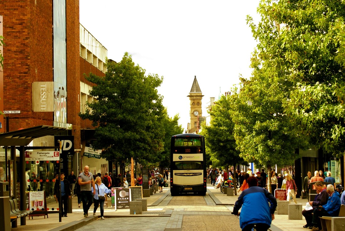
This is my favourite image that I have ever taken, because of the huge amount of detail. Each persons face, the colours of clothes, and the different kinds of people. The bus down the middle of the road creates a balance, which makes the image even better. It is centred to the road, and the church on the right side of the road at the back, makes seem uneven at the top of the image. I like how there are buildings and signs, and a single tree on the left, and many trees on the right, as it creates a sense of differentiation between humans and nature.
|
I like the background blur in this image, and how clear the front in is comparison. the small details look great in front of the bridge behind. It could be improved by being taken from a better angle.
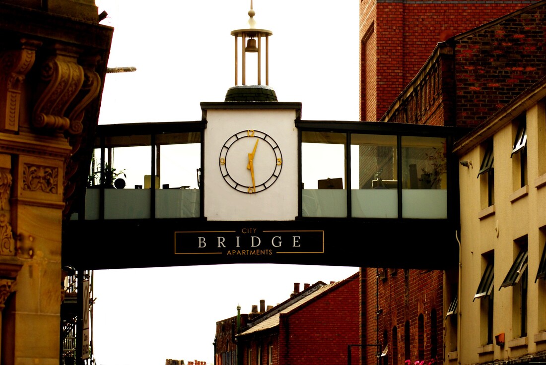
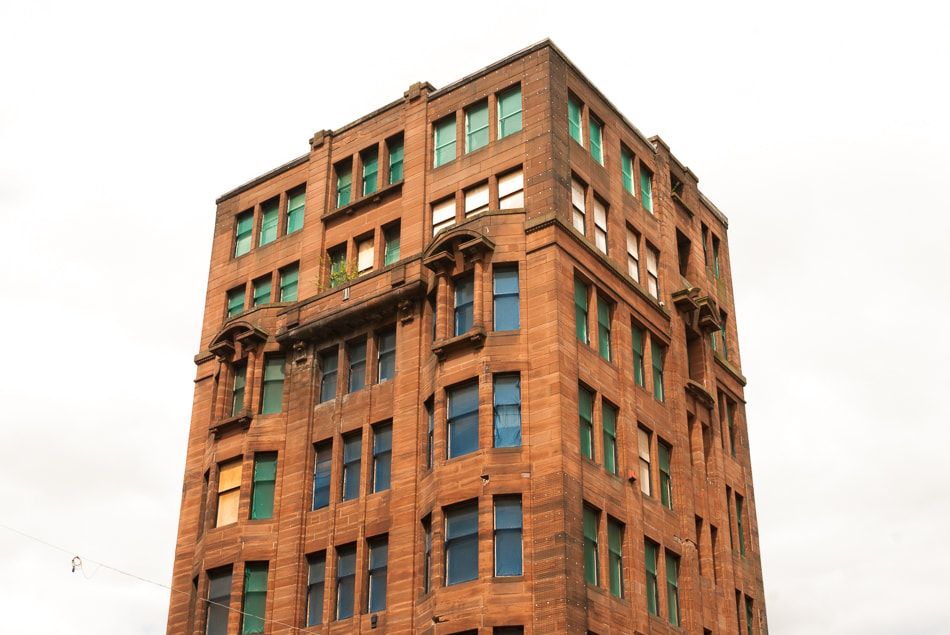
This is another of my favourites, because of many reasons, such as, the windows on the right side of the image, because they are all open, the clock right in the centre of the image, and the small details within the bright, like the plant pot on the left. It could only be improved by being slightly more zoomed out, as I want the top of the bell in the image too.
|
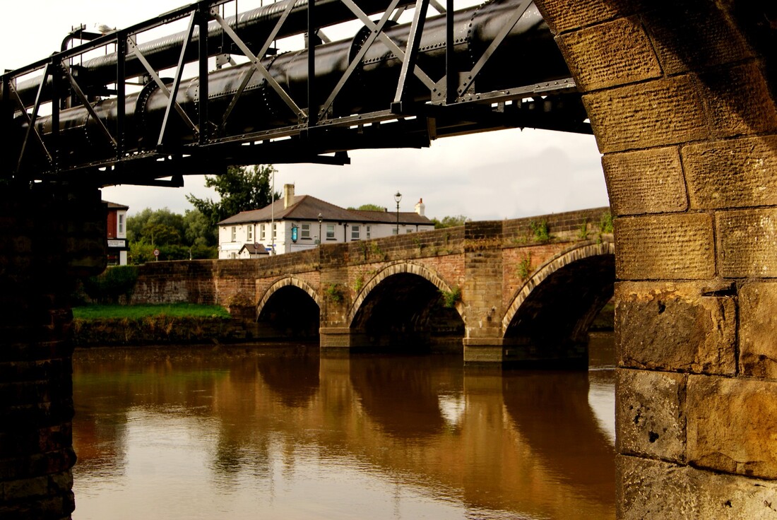
I like this image a lot because of the strong reflection of the bridge, and the contrasting white sky and black pipe. I would improve it by retaking it, slightly to the right, to avoid getting the house on the left in shot. I like how the red/brown brick looks with the small patch of green grass, seen on the left of the image. The details of the brick stand out against the plain sky and gentle water.
|
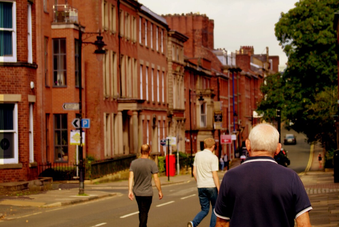
I do not like the colours in this image much, although I like how the focus of the image is on my grandfather. The green of the tree and the blue of his shirt work well together. To improve this image further I would retake it without the other two people are not in in, and I would place the camera more central to the middle of the street.
|
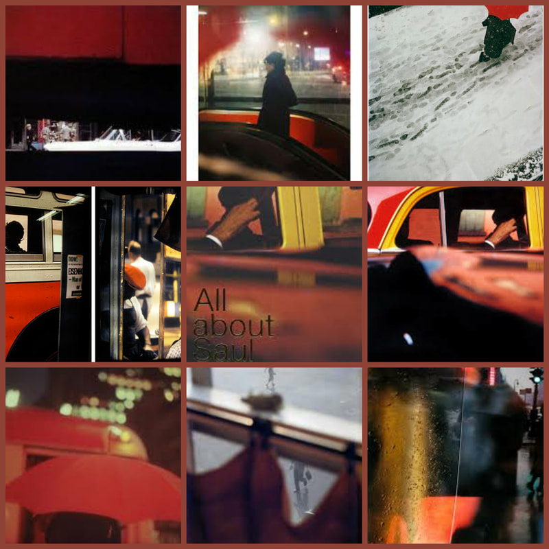
Artist research / Saul Leiter
|
I chose this artist because of his the blur in his images. If is done by using rain, wet glass, and a shallow depth of field. This creates a mysterious feel to the images, and makes them seem more aged. His images often contain the colour red, which creates unity within his compositions. other images have a good dynamic range, for example, the top row, second from the right. The white building in the top left corner contrasts nicely with the dark road and silhouette. I could emulate his work by taking photographs in Preston white it is raining. I would have to use a tripod to avoid motion blur.
|
I don’t have a philosophy. I have a camera. I look into the camera and take pictures. My photographs are the tiniest part of what I see that could be photographed. They are fragments of endless possibilities. I go out to take a walk, I see something, I take a picture. I take photographs. I have avoided profound explanations of what I do. |


Shoot plan / Saul Leiter.
For this shoot, I went out onto my school car park, at around 4pm. I completed a shoot of myself. The outdoor shoot was done in the evening, as this allowed for low lighting. The cloudy skies allowed for this to work even better. The portrait shoot will most likely be done outdoors, using little light, all the available light came from cars, streetlights, classroom windows, and the very little sunlight we had lefty. I will use my, DSLR camera, and kit lens for the portraits. I will use a shallow depth of field, to focus only on the subject. I will do this by using F/5.
Research and Investigation / Initial Images / Saul Leiter
|
|
Research and Investigation / 4 Best Edits / Saul Leiter

|
|
|
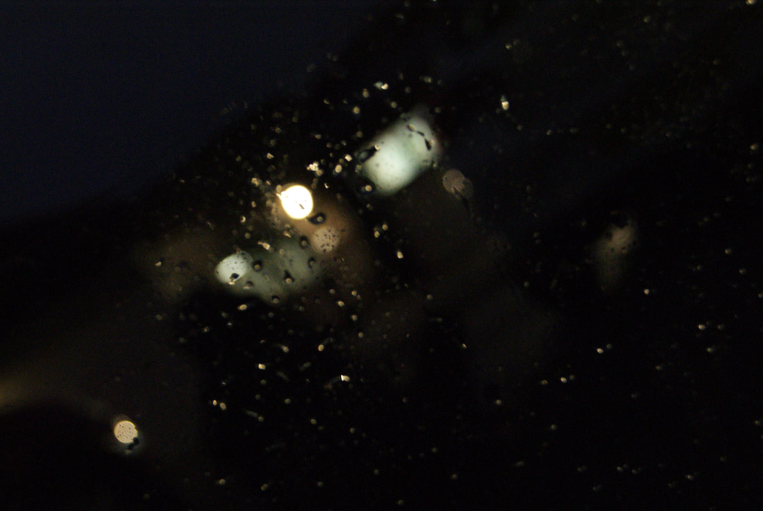
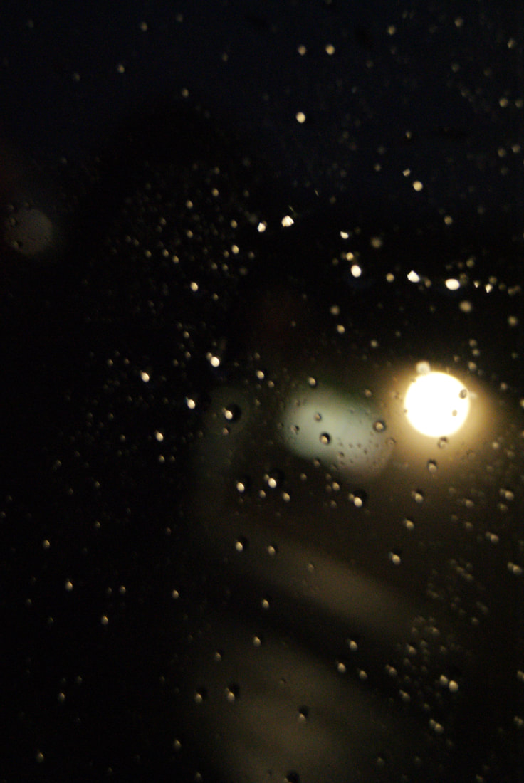
This is my favourite of the shoot, because of the light coming from the window, bouncing off my glasses. The Bokeh effect was done by placing a plastic sheet, sprayed with water, in front of the camera.
This image was not put into black and white, rather had the vibrancy fully reduced. This left no colour, except for the yellow light coming from a classroom window. I like how the water droplets frame the circles of light.
|
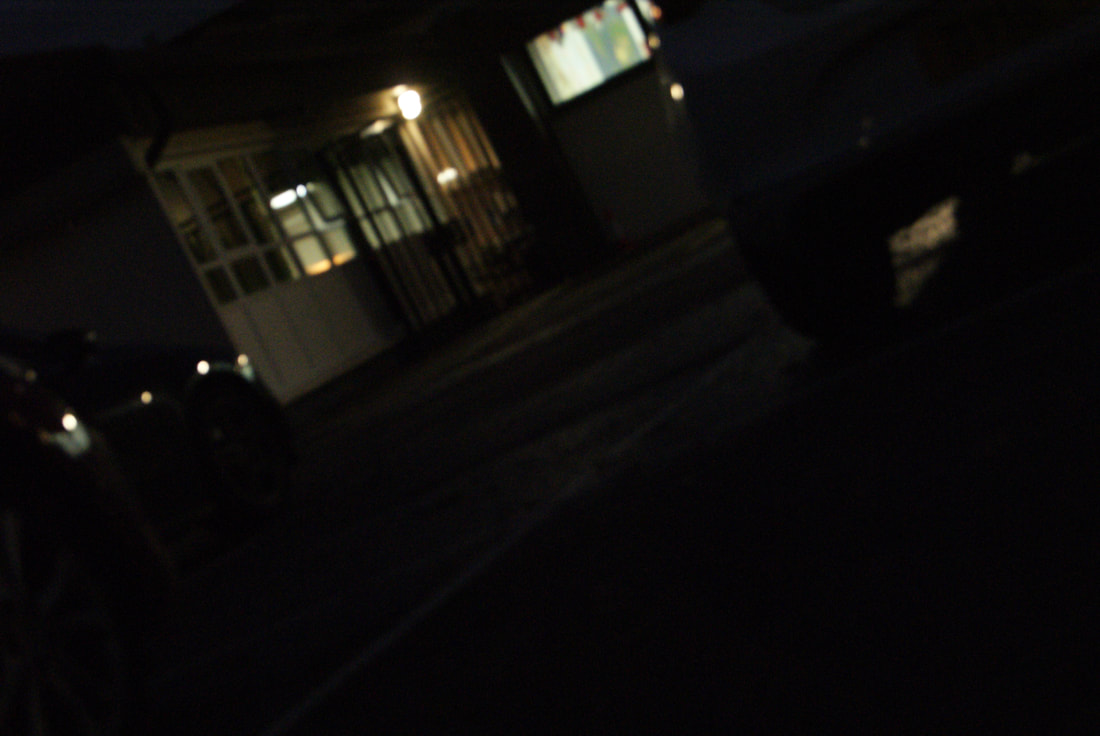
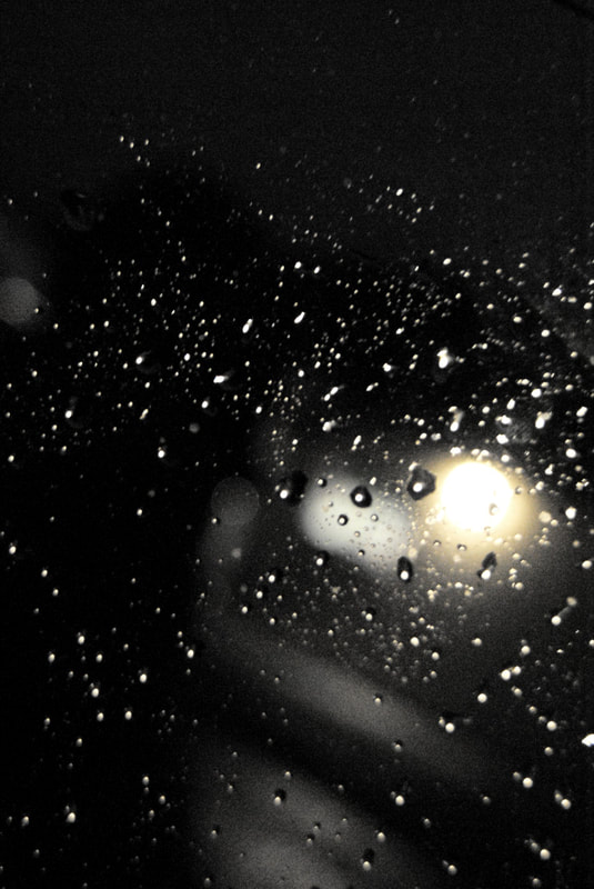
In this image, I like the contrast between the bright yellow light, and the dark sky. If the noise was reduced, it would be a little better. The green light in the window is coming from a classroom window, the green most likely is the map that is on the wall, and I like this because it was an accidents connection to geography, with ties into urban environments.
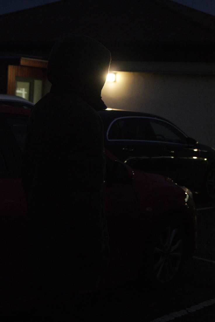
The dark reds, mossy greens, and deep blues in this image really tie it all together with the intent, to create a dark, mysterious sense that almost hides the shadowy figure.
|

Research and Investigation / Best Image / Saul Leiter
|
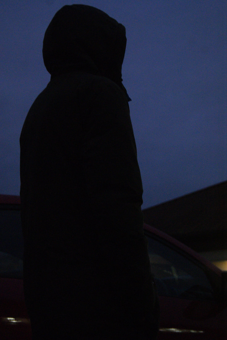
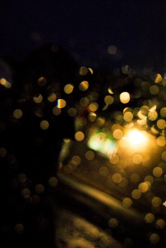
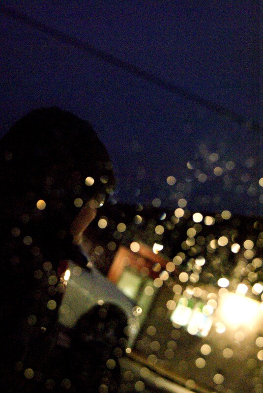
This image went well because of the contrasting colours, bokeh effect, and mood to the image. It portrays a sense of longing, because of the figure stood in the dark looking towards the light. The dark line above the figure's head forces the viewer's eyes down onto the subject, and away from the sky, then the eyes are led to the window, by the small spots of light, become more and more abundant, closer to the window. This is the effect of the bokeh. As the viewer looks at the image for longer, they may realise that the figure is sat on the ground. This exaggerates the sense of confusion and mystery.
|


|
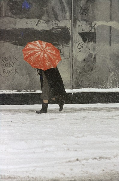
Artist investigation / Saul Leiter / Semi AnalysisSaul Leiter is the photographer of this image. The image was taken in 1960, and is called 'Snow.' The genre of this image is portraiture with a specific focus on urban environments. The props in this image are only a window and what seems to be a car in the background. The two figures appear distorted and abstracted by the condensation running down the window. I felt this picture may have been taken in a street or outside a café.
The composition of this image shows a person turned side profile from the camera, stood behind a fogged up window with fragmented writing on it. The rule of thirds has deliberately not been used, as the subject is stood slightly to the right of the frame in an unorthodox manner for this period of time (1960's). The images was taken at the viewers eye level, to make the viewer feel like they are stood behind the window gazing out at the figures. The most striking part of the image is the use of the foggy condensate on the window. This photograph was taken from a far distance, which implies that the two individuals did not know that the image was being shot. It is ordinary, mundane and in some ways dreary however I feel Saul Leiter intentionally wants this because he captures the distorted figures obscurity against the grey contrasts of their environment. Cleverly, in terms of colour, Leiter uses mustard yellow against mossy greens, on a backdrop of muted grey tones. I think this makes the image subtle yet powerful. Another person has been half cropped out almost to obscurity, which places more focus onto the main subject matter (the figure), then my eye is drawn to the other main components which include the mustard yellow van and the fragmented lettering in the foreground. There is a slight line above the subject's head (deliberate use of framing) which pushes the focus down onto the scene. The photo has been taken with natural light on what appears to be an overcast day. I can tell this because there are no harsh shadows or contrasts. The direction of the sunlight leaves the image looking moody and atmospheric. To emulate this photography myself, I would use a café window on a grey rainy day, seeking out condensated windows. I would need to place the camera on a table to ensure everything is in focus, avoid using flash (perhaps a diffused off camera flash) and have a larger aperture to let more light in. Leiter's intent in the image was to create an sense of mystery. This creates questions in the viewer's mind such as "What are they looking at?" "Where is the picture being taken from?" and "Does the subject know that the picture is being taken?" Also, questions about the text on the window are possible, as they are partly cut off from the image, and has been weathered to the point of coming off the window. The dark figures against the yellow car could represent how light often is kept in the background, out of focus, while darkness is placed front and centre. |


|
I got immediately attached to Leiter's work, but didn't understand why. As I did more and more research into his work, and the made connections within it, I noticed the red/yellow colour schemes within most of his photographs. Also, a blur or haze is seen in an amount of them. This is significant to me because the colours, and blur, make all his work look very similar to the cover art of a song I have become very attached to, Stars Will Fall, by Duster. I correlate this song with the feeling of watching parents cry, as no more than 3 days after I found the song, I watched my father cry, the day after that, my father figure cry, and the day after that, my mother cry. Later on, in January, I saw my stepfather cry, and my first thought was this song, and this artist. Since then, the song has always made me feel this calm, aching sorrow for the people I saw in pain, adults who never cry. This feeling is reflected into the work of Saul Leiter, for me. The work feels very personal and emotional to me, because of these tears I witnessed.
|
|
|
Artist Investigation / Cocu (Chen ) Lui


|
I chose this artist because he does not always use the rule of thirds. I find this interesting, and looks good with his style of photography. I like the cloudy, dark images, and the small flashes of colour in others. I could emulate his work by taking photographs of a city, some in black and white, and use motion blur. https://iphonephotographyschool.com/cocu-liu/
|
“The best camera is the one that is with you” Cocu Chen Liu |
Shoot Plan / Cocu (Chen) Lui
To emulate the work of Cocu Lui, I will need to take photographs in a city, using motion blur, camera shake, low angles, and reflections. a lot of his work is full of light, and pops of colour, To achieve this, I will need to go on sunny day, and stay in grey/brown areas with just colourful signs, people or cars. I will use a long shutter speed and a tripod in some images, and a shorter shutter speed in others, while gently moving the camera. This will give a warped effect. I will use a smaller aperture for the brighter images and a larger aperture for the darker images, being careful as to not cause any blurring.
Artist investigation / Cocu Liu / Semi Analysis


|
Cocu Liu is the photographer of this image. It was taken in San Francisco, on an iphone7 plus. The building seems to be distorted, because of the motion blur, and double exposure. There is an impression of a face in the bottom right corner.
the composition of the image is a crowd of people, in front of a tall building. The entire image is distorted and warped by motion blur and/or double exposure. In this image, the rule of thirds has been used, this is shown by the centred building and sky that covers 2 thirds of the image. the image was taken from approximate eye level, it may be slightly above eye level. This gives the effect of both being a part of the crowd, and standing above them. The photograph was taken from a far distance away from the building, this ensures that the whole thing is within the image, framed and centred. The blurring of the image gives the effect of dizziness and uncertainty. This could be there to give the effect of being anxious, afraid, overwhelmed by the crowd/city. Most of the image is dull in colour, apart from the blue sky and orange trees. There are other reds and browns within the image, which contrast against the light blues. This contrast between the colourful nature and monotonous city creates a sense of unbelonging. The sky frames the building, and the blur hides the faces and cars in the foreground. This leads the eye to focus on the building, and move down towards the ground. Then the eye moves towards the ghost of the building, and the faint road sign beside it. There is a triangular shape to the building, which leads the eye upwards, again. The image was taken outdoors, during the day, but the time of day is unknown, due to the lack of shadows and obvious sunlight. This makes the viewer searching for a source of light, only to unsuccessful. The only light within the image is coming from the hidden sun, and cars. To emulate this image myself, I would take an image of a tall building, without a tripod, and a long exposure time, slightly moving the camera. This would give the blurred and distorted effect. The intent of the image was to create confusion, and questions such as "Where was this taken? What does the sign say? and Who is in the crowd?" I like this uncertainty. The colours also reinforce this, the viewer may wonder why the human aspects of the image are so dull compared to the natural aspects. The focus on the human side makes his feeling even stronger, the feeling of confusion, and curiosity. |


Artist investigation / Tomas Cambas


|
I chose this artist because I like how geometric and bright the shapes are. The solid backgrounds, few details, and one or two subjects, make his work easy on the eyes, and relaxing. I could emulate his work by taking pictures in Preston, when the sun is out. I would use a low ISO, quick shutter speed, and a large aperture. During editing, I will likely increase exposures, clean up spots, and reduce noise. Cambas uses colour in his work, quite significantly. Each image has a different focus colour, which creates contrast in his work.
|
https://tomascambas.com/ |
Shoot Plan / Tomas Cambas
Cambas' work is all very geometric, and bright. I will emulate his work I will have to take images in a bright public area, to get that "worn away" look and feel. The weathering of paint, rusting of gates, and the moss coated walls will all be captured using a short shutter speed, and medium aperture, as this will give a bright, clean, focused look to the photographs. I may use a tripod to avoid camera shake. I will crop my photos down into squares and try to created squared in my original images, to emulate this aspect of Cambas' more recent work.
Artist investigation / Tomas Cambas and Saul leiter comparison


I chose to compare Tomas Cambas and Saul Leiter because of the differing styles of photography. Cambas is often bright, and sunny, while Leiter's work is dark and rainy. Another difference is the fact that Leiter's images are distorted, Cambas' are not. Leiter includes people in his images, Cambas does not. I like the contrast, juxtaposition, and differences than these two artists create with each other. The contrast in the amount of and placement of focus in each artist's work is interesting to me, how Cambas creates very neat, focused images, and Leiter's are distorted and contain some motion blur. This seems to be intentional.
Lee Friedlander / Tomas Cambas / Saul Leiter Comparison |
This image, of Cambas', has both bright and dark tones, shadows and obvious highlights. It is correctly exposed, and has an even amount of light and dark. This image includes some plants, and litter. This is juxtaposition. There are no words or drawings in the image, everything there is natural wear-and-tear of the city, apart from the spray painted rectangle in the right centre. This is likely graffiti, which is a negative thing is today's urban environments. The graffiti is done only on the dark side of the painted wall, this highlights the negativity of graffiti. The bright side is cleaner and less touched. The scratches and diagonal lines on the darker side make this idea stronger. The separation between the dark and light side of the wall is not neat, or straight, and so breaks the rule of thirds. The ground in the bottom of the image breaks this rule even further. The larger plant on the right side of the image make the image uneven and unbalanced.
This image, taken by Leiter, is underexposed, dark, and muddy. The colours are all blacks, whites and greys, apart from the bright red umbrella. it has mostly dark tones, and limited bright tones. There are no plants in the image, the only natural thing is the snow, which has been thinned and greyed by people walking over it. On a condensated window, a popular thing in Leiter's work, There are words, symbols, and games of noughts and crosses drawn. Sections of the condensate are wiped off, this could be because someone disagreed with what was written, or didn't like the symbols or drawings on it, and wiped them away. This is a very human, childish thing to do. Also pictured, is a person, wearing blacks and greys, holding a red umbrella. Umbrellas are used to protect someone from the rain, a negative thing, so it being the only coloured thing within the image expresses the positivity of being kept warm, dry, and happy. The dark clothes oppose the red umbrella, this highlights the idea of attempting to hide from the cold and dark using light, but being stuck. The persons legs are slightly showing, and are in colour. This would make them feel more cold, but the colour expresses warmth. Again, this is juxtaposition. Cambas' image is brighter, but contains no people. This is different to Leiter's image. leiter's contains writing, but no plants. The background of Leiter's is grey, and is changed by the actions of people. Cambas' image has no background, as it contains only a brightly coloured wall, and the ground below it. Cambas' image seems to be more edited than leiter's due to the bright colours within the image. Leiter's is a more dynamic composition than Cambas', and Leiter's has colder, duller light than Cambas'. The forms and shapes in Leiter's image are more loose and misshapen, Cambas' image has blocky, fixed forms and shapes. Leiter's image has more noise than Cambas'. The images are similar because they were both taken in the city, and both contain walls, some form of nature, and some form of human interaction. Both images are taken from approximate eye level |


The work of Lee Friedlander is a combination of Saul Leiter and Tomas Cambas. It has the city, and people aspects that they share. There are also a lot of numbers and letters in his work which is similar to that of Saul Leiter's. Some of his work includes distortion, and some are square and blocky. Friedlander is different because all of his work is in black and white, the other two artists are in colour. The artists are similar because of the cities that are seen in all of the artists' work. These three images are all correlated in my mind, because of the dark colours and vehicles in both leiter's and Friedlander's, and the red umbrellas in Cambas' and leiter's. Also, Friedlander and Leiter both have framed their images very well, one using a window frame and the other using a car window frame.

|

|
|
Artist investigation / Lee Friedlander


|
The work of Lee Friedlander is varied, but I am mostly focused on the cities that he has photographed. I chose this artist because of how his work ties in with my previous artists, how old the images are, and how unusual they are. The fact that they are in black and white is different to all of my previous artists, which I appreciate. To emulate this work i would need to either set my camera to black and white, or edit them after the shoot. I would include sharp shadows and people within the images. I like the social aspect of freidlander's work, it portrays a sense of humanity and society.
|
“I always wanted to be a photographer. I was fascinated with the materials. But I never dreamed I would be having this much fun. I imagined something much less elusive, much more mundane.” – Lee Friedlander |
Shoot plan / Lee Friedlander
Lee Friedlander takes photos of reflections in the city, all of which are monochromatic. To emulate his work I need to take photographs in a city, specifically of reflections, through windows, and with shadows as the subject. This is because Friedlander uses shadows to exaggerate the subjects within his work, sometimes taking over the viewer's attention, others barely attracting any attention. His images are very "American" so to put this into my work I could make mine very "British," this would be the same because both groups of images would be portraying the country that they were taken in, and the nationality of the photographer. I would need an aperture of f22, a shutter speed of 1/200, and ISO of 200 to best emulate his work, given I get the same weather conditions.
Artist Research / Berenice Abbott
Berenice Abbot was a photographer in the 1930s. She took photographs of buildings and science interpretations. Her work in monochromatic because of when it was taken. I chose this artist because of the interesting shapes and angles within her work. I like the combination of bird's eye and worm's eye view images, along with the closer images of streets and shop fronts. The winding shapes of some paths, contrast greatly to the straight-on, visually led images of streets. the images, although taken in America, sometimes remind me of Blackpool, especially the example image, top row , second column from the right.


Shoot Plan / Berenice Abbott
To emulate this artist I need to set my camera to monochrome mode, and take photographs of shops, streets, and buildings from high windows. I could do this in Blackpool, taking photographs of the bright streets in monochrome mode, to create a range of brightness's. This will create interest and attract the viewer's attention. I will need a tripod, and a telephoto lens. I will use a smaller aperture, and short shutter speed.

6 Best Edited Images


Top left- This image is good because of the huge amount of detail within it, from the scaffolding. The perpendicular lines work well with the plain, gradient background. I would improve it by lowering the brightness of the smaller building in the bottom right corner, as it slightly throws the image off.
Top right- I like that this image is an oxymoron, because of the modern poster on one side and the old building and the tree on the other. the lighting was not perfect in this image, but it adds to the differences between the modern and older sides. I would improve it by retaking it on a dimmer day, to avoid the of glare that the poster received.
Top middle- I like the angle of this image, and the lighting of it. Although the editing process was difficult, an slightly patchy. I like the contrast between the dark doors and windows, and the almost glowing reflections. I would improve it by retaking thee image without the obstruction in the top right corner, which was removed during editing.
Bottom left- This is my favourite image of the shoot because of the contrast, and cut-off between the chimneys and the sky. the bridge across the middle juxtaposes the vertical chimneys and creates an opposition within the image. the lamp post directly in front of the bridge furthers this. I like the details of the windows and bare tree against the flat, dark walls.
Bottom middle- This is another highly detailed image, this time the details are the bricks and curtains seen on the right side of the image. The left side is blacked out from shadow, which I like as it creates clear division similar to the top right image with the poster an building. the details along the top of the building are very rounded and repetitive, and they create a frame for the photo, within itself.
Bottom right- This image should have been taken from a lower angle, but the lighting works out. During editing I lowered the brightness of the front of the left building, which helped balance out the contrast within the photo. I like hop there are few details on the left building and many on the right.
Photo safari / in and around school

I like this image because of the colours and tones within it, the reds and greys work well together. I would improve the angle from which it was taken from.

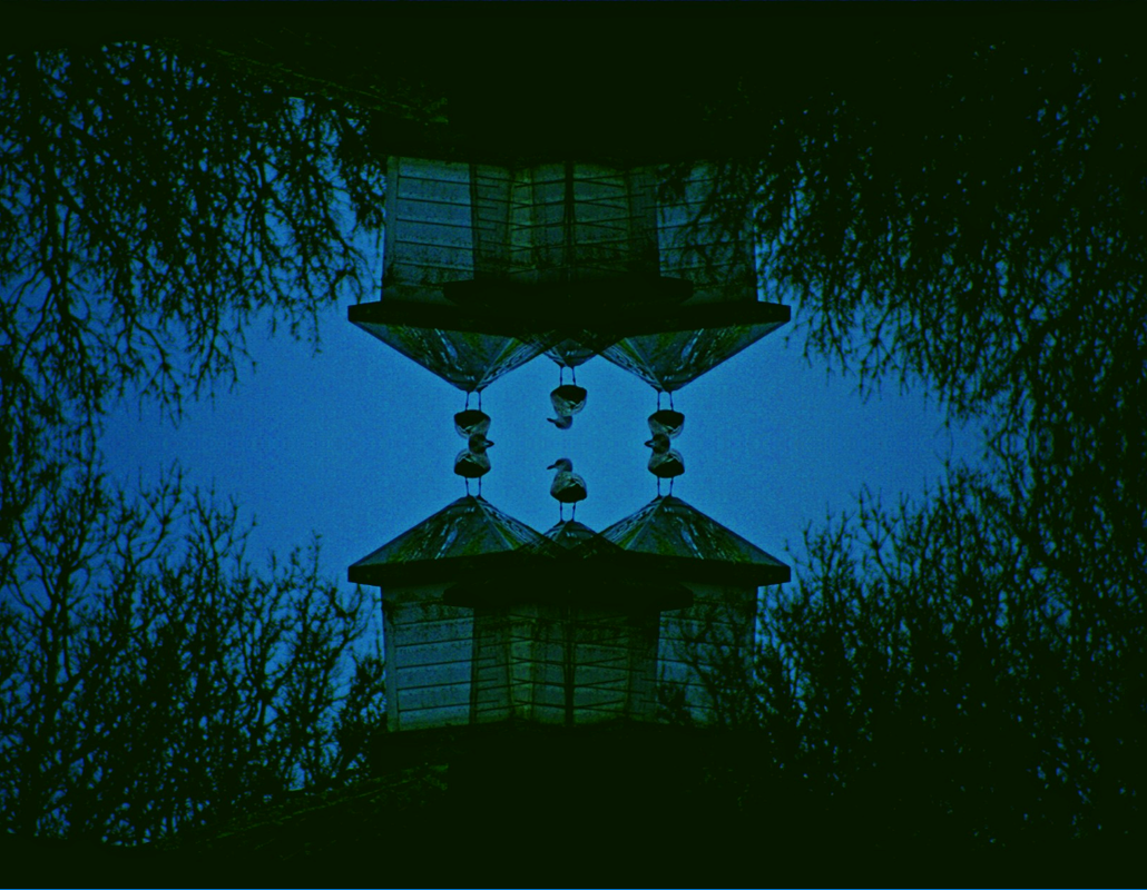
This image is well balanced, I like how one side is ghostly, and the other full on. I would improve the symmetry of the background in future editing. The dark browns against the light yellow works well in my opinion,
|

I like the ghostly effect that the editing gave this image, and the darker blue stripes along the sides. I would improve the saturation of the image.
I think this image would look better rotated clockwise, so the centred darker triangle is at the bottom. I like how there are triangles within the banner triangles, as it creates more of a balance and connection.
|

I like how this image contains both cars and a building in the background, and how the red lights and red roof work together. I would centre the image a little more in editing.

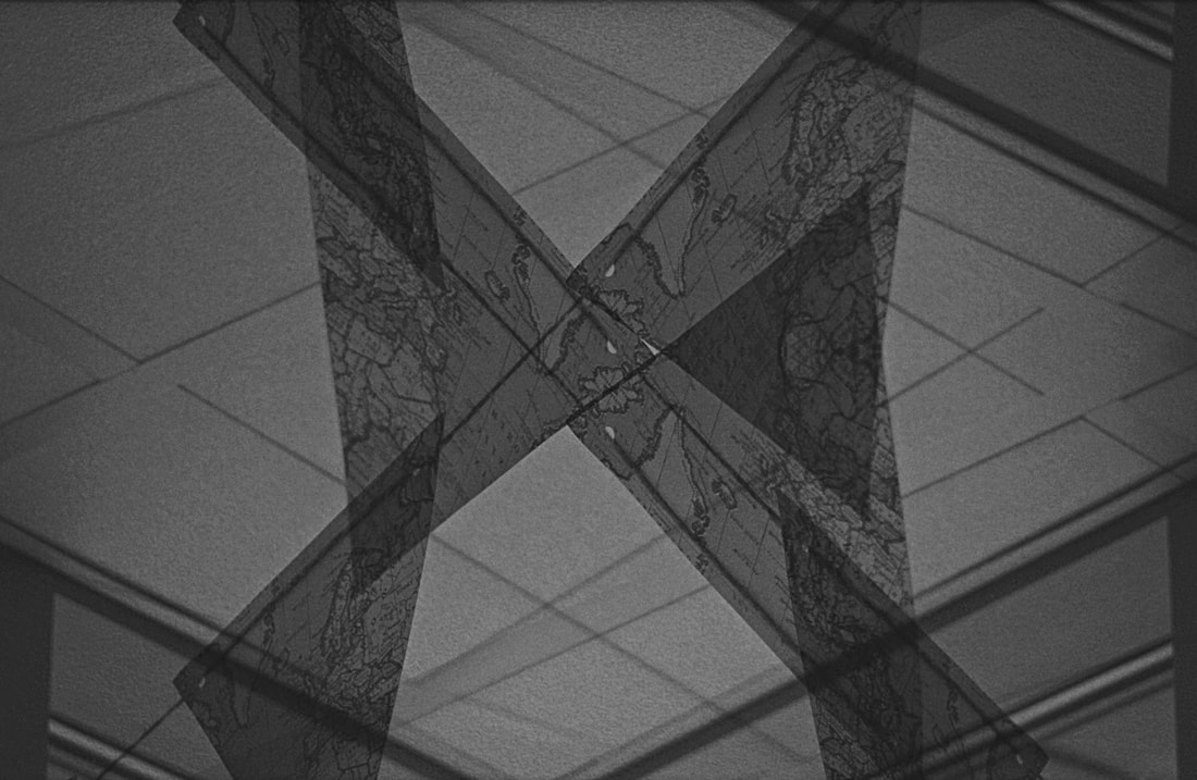
This image is my favourite because of the repetition and symmetry I created in editing. I like the colours and details of the building. The birds all edited together creates a strange and mysterious feel to the image.
|
Best edited image / evaluation
|
I like this image a lot, because of the colours, contrast, shapes, and symmetry/repetition.
The dark greens, medium blues and black all complement each other in my opinion. This is because of the varying brightness of the colours, from medium to complete dark. I lie how the blue and green are situated in the centre of the image, while the black borders and frames it. The general shapes seen in the image are ovoid, triangular, and rectangular. The visible portion of the blue sky is an oval, the tops of the columns are triangular, and the columns in themselves are rectangles. The repetition of the images makes 4 of the birds blend into each other, which I think is interesting. The repeated columns stand out within the centre of the image, and draw the viewers attention. The angle of the image creates the illusion of looking straight up at the trees, and straight across to the building. This creates an interesting and strange perspective, which I like a lot, especially when it is combined with repetition and surreal edits. |
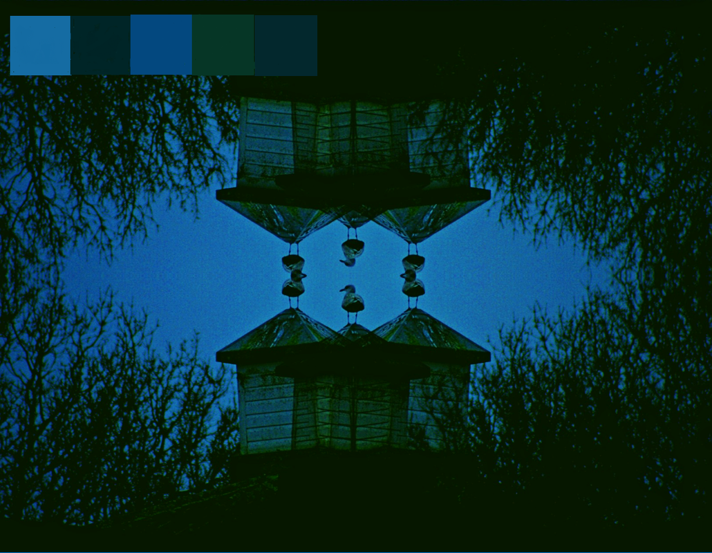


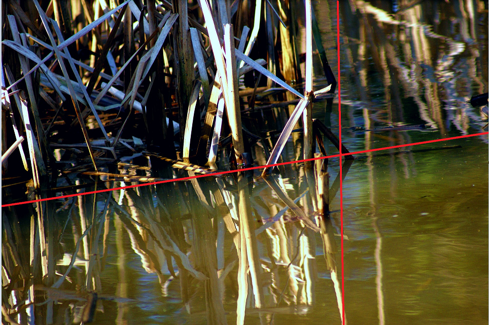
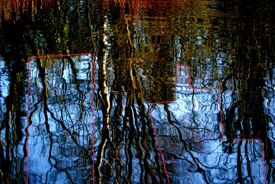
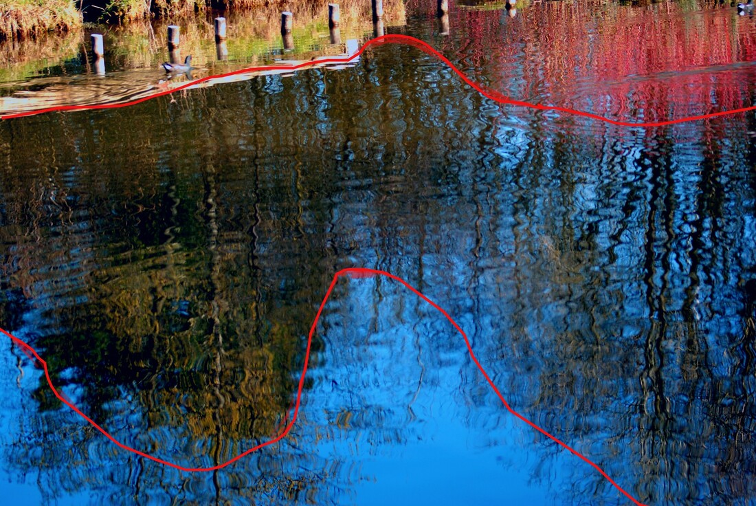
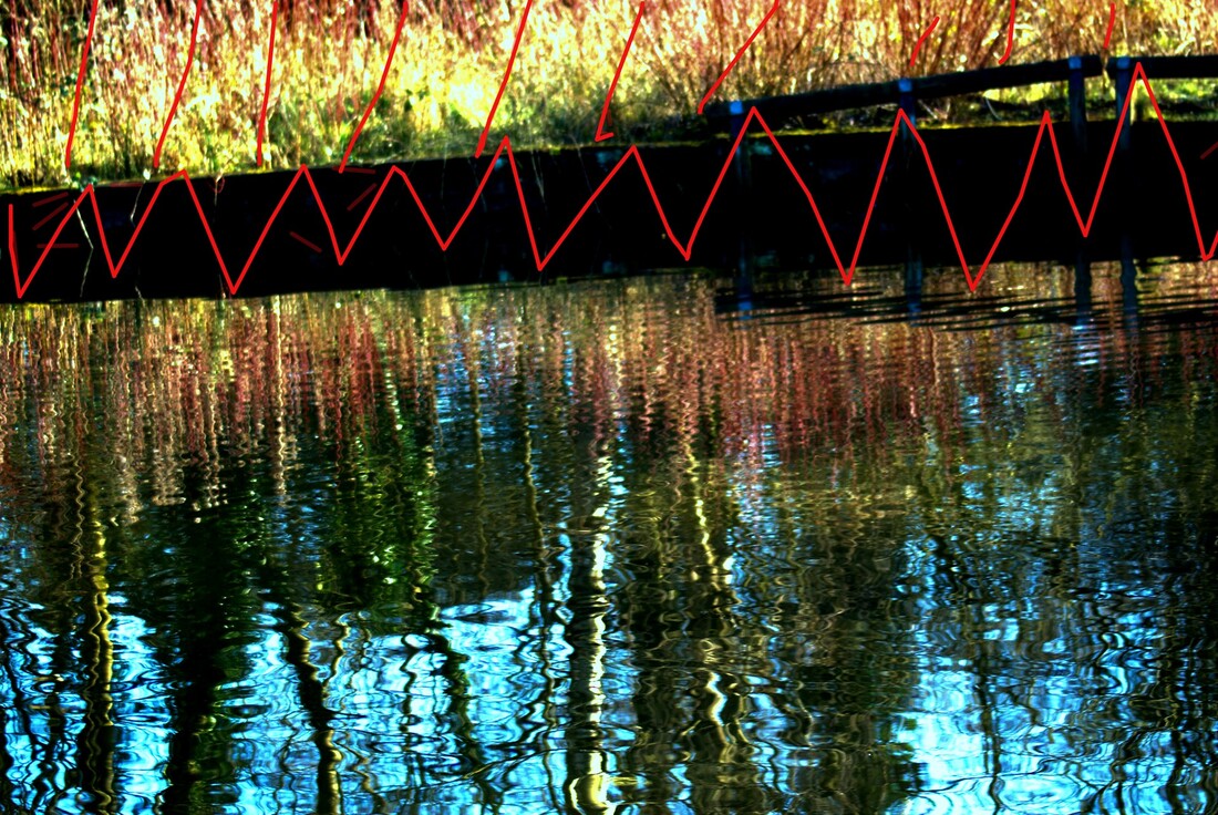
Photo Safari / Reflections
For this shoot I intend to use auto focus, to eliminate any motion blur, or the focus being in the wrong place. I used a short shutter speed to avoid motion blur any further, as all of these images were taken on ponds. I like how this shoot combines both abstract nature and urban environments, because the park is man-made, and is in an urban area, but the images are of plants and water. I plan on using both a kit lens and a telephoto lens on a DSLR camera. I will do the shoot at midday- evening to get the best lighting in the sunny weather. I will not use a tripod, because I will need to move around quickly to capture the best light, and any animals that I want.

Reflections / Best Edited Images


|
Top left- I like this image because of the contrast in colour, and the gradient of reflection intensity. This means how the reflection is very strong in the bottom left, and gets gradually weaker towards the middle right. I also like how the left side of the image is significantly darker than the right side.
Top middle- I like this image a lot because of how clear and focused the reflection is. The blue toned shadows work very well with the orange/yellow reeds and water. The distortion in the top right shows the movement of the water, which creates a clear line within the image, and 4 clear sections. Top right- This is the most popular image in this composition, because of the overall red tone, and the clear, splitting reflection. I like how vibrant and sunny the image is. It feels very sharp, and angry, because of the sharp plants and red colours. Bottom left- This is my favourite of the shoot, because of the warped, distorted reflection. I like how you cannot see the trees in themselves, only their reflection. this creates a mystical feel to the image. I like how there is such a strong contrast between the sky and the dark trees. This image cannot be recreated in any other season, which a =appreciate. it was taken in the end of winter, when the trees are bare but the sun is out. Bottom middle- I dislike this image the most out of the 6, because how the exposure doesn't work well throughput the entire image. the top left is overexposed and the bottom right is underexposed. Despite this, I like the dark middle and bright top and bottom. this creates balance. The distorted reflections look good too, along with the clear, focused bank of the water. Bottom right- This image is not well focused, and is too bright. The increased contrast, done in editing, make the barrier/fence and the bank look almost completely black. This increased exposure made the plants on the top left look overexposed and to vibrant compared to the dark plants. Although, I like how the reflections in this image work, they were my main focus when taking the image. |
|
Photo Safari / Monochrome
For this shoot, I intend to go to Preston, and take photographs of the buildings there. I will not use a tripod, for ease of transport and angling. I will use auto focus and a short shutter speed to avoid camera shake, as I will be holding the camera upwards for most of the shoot. I will use a large depth of field, to ensure that the entire image is in focus. The shoot will be done at midday, in bright, sunny weather to get the best lighting, and to avoid distortion.

Monochrome / Best Edited Images


Top left- I like this image a lot, due to the clear lines, and strong, contrasting black and white. The scaffolding within the image gives it a lot of detail and adds a story to the image. The viewer may want to know what the building is having done, or what is being made to be. These are some of the things that I wondered while taking the image. I like the leading lines in the image, and the tree in the bottom right corner. Although, the mid-left is slightly overexposed and knocks the rest of the image out.
Top middle- This image has mild camera shake, although it is still the favourite out of the 6, with my classmates. It is not m personal favourite but I do like the angles and contrast. It could be improved by being in complete focus, and having the exposure on the small, triangular sign (mid left of the image,) reduced slightly. I like the reflections in the windows but would rather that they be the focus of the image.
Top right- I like this image because of the tree on the left hand side. This is an image that can only be taken in winter/ early spring, because of the bare tree. I like the effect that this gives, being able to see the building through the tree, but only the major details. I would like to remove the telephone line from the image, as it ruins the historic effect. I like the visibility of the small detail of the building, and how they show up so intensely in the sun.
Bottom left- I like this image a lot, as it reminds me of a good memory of mine. A school trip to London. The lights within the image remind me of when I was sat under lights just like them, drinking a hot chocolate with my favourite teacher. This makes the image very significant to me, and moves it to be my favourite image of the 6, despite its motion blur and overexposure. I like the details of the wall on the left hand side, and the leading lines.
Bottom middle- This is my second favourite of the 6 images, because of the editing which I did. I noticed that the 2 people within the image were blurred, because they were moving. Instead of letting this ruin the image, I embraced it, and blurred out the entirety of the 2 people. This creates a sense of mystery, and shyness in my opinion. I like how there is a torn up poster of a person just behind the child, which isn't blurred. This gives importance to the 2 real, blurred people.
Bottom right- This image has a bit of camera shake, but I still like it. It was taken at the same station that I started the school trip to London, (mentioned in the evaluation of the bottom left image) which makes it significant to me. I associate this image with the feelings of excitement of joy, 2 of the main emotions of the trip. The two people in the photo were motion blurred, so I, similar to the bottom middle photo, blurred them further. I like the straight lines of sunlight, and the leading lines of the cables above the train. The triangular logo on the train adds to the geometric nature of this image.
Final outcomes / compositions
|
|
London shoot
On the 22nd of October 2021. I travelled to London with my photography class. I took many photographs of places such as the Victoria and Albert museum, the Tate Modern, Leicester Square and the Euston train station. Many of these photos were very different top each other, creating an interesting shoot and day out.

Shoot aim / composition 1
For this composition I want to edit images using paints and washes. I have been inspired by the style of Stephen Gill's photography. I can use his urban environments images to emulate and the nature images as inspiration, I like the light, haziness and intentional blur of the images. Later on I want to look at the use of overlays. To physically edit these images, I wan to use paints, papers, and other images, combining them with the original.
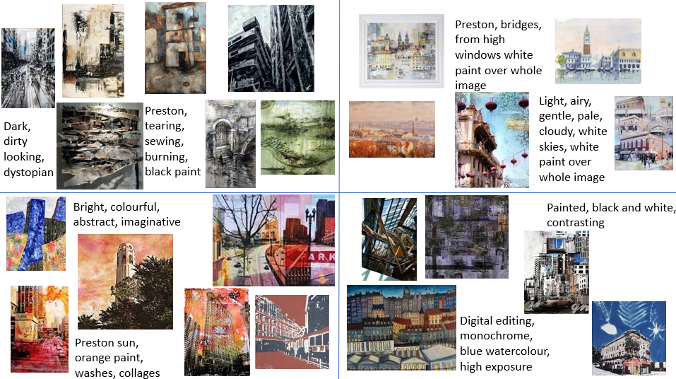
Inspirational images / Stephen Gill

|


|


|

|


|
Composition 1 / shoot plan
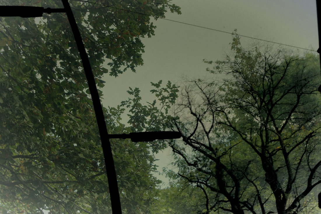
For this shoot I will need to take images on streets, of bridges, and occasionally of pieces of nature. I will need to make sure my images are very light and hazy, and have intentional blur, to get the same effect as Gill's work. In later editing I will add black overlays, some made by other images from the same shoot but made dark. I will need a large aperture to achieve the light and blurry effect. to further this I will do the shoot in early morning, hopefully in the fog, as this will greaten the washed-out, light effect. the camera used will be a DSLR, and I may use a tripod. The natural sunlight used will create faint shadows due to the early time of day. I intend to shoot with a larger aperture to ensure a shallow depth of field.
"haunt the places that haunt you"- Stephen Gill
Composition 1 techniques / photographers
To complete this composition I will use digital multiple layering, during earlier editing. This will be completed using overlays, and Pixlr editing. Physical editing may be used to darken overlays or "fog" out backgrounds. This can be done using watercolour or acrylic paints. I will take inspiration from multiple artists, such a Stephen Gill. This means that I will create images which are varied, some being more bold than others, Gill's work is very faded and gentle, I like this and plan to emulate it well.
Composition 1 / best edits
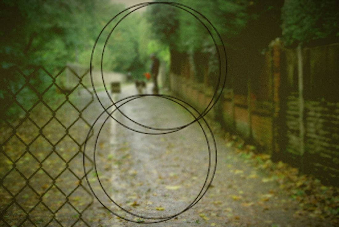
I like this image because of the combination of dark and light, gentle colours. The overlays create contrast and depth to the image. The leading line running slightly to the left, on the lamppost, and on the lean of the trees' leaves, create interest for the viewer. I feel that this image emulate the work of Gill well, with a touch originality
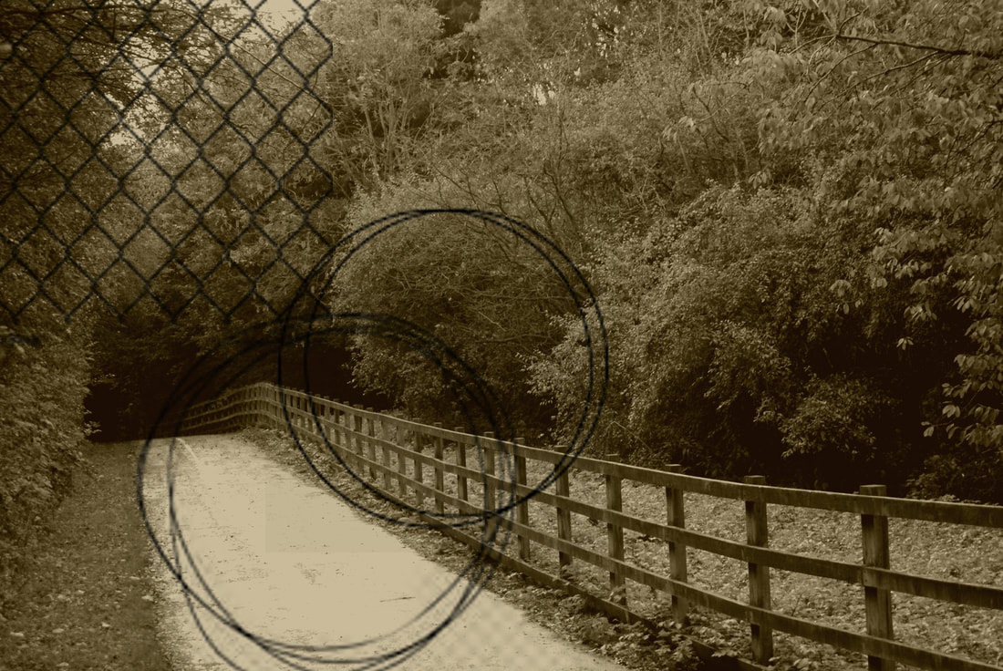
I love the sepia tones in this image, the browns work well with the black overlay. The circles oppose the leading lines of the path and fence. The fence portion of the overlay blends in well with the dark, almost black, leaves. This reduces the cut-off effect. It could be improved by making the overlay stand out more, by reducing the brightness of the background
|
I like the sepia tones within this image, they work well with the black overlay. Within this overlay there are a combination of both circles and straight lines which complement each other. The dark leaves in this overlay are opposite to the light, hazy leaves in the background. I could improve it by making the overlay less grainy.
The positives of this image are the bright greens, black overlay, and foggy, blurry background. I love how the colours work together, and how soft but bright they look. The way that the circles in the overlay contain my father and dogs, makes the image very sentimental to me. it could be improved by altering the fence portion of the overlay, as it has jagged edges which do not fit with the softness of the rest of the image.
|
Composition 1 / final image evaluation
|
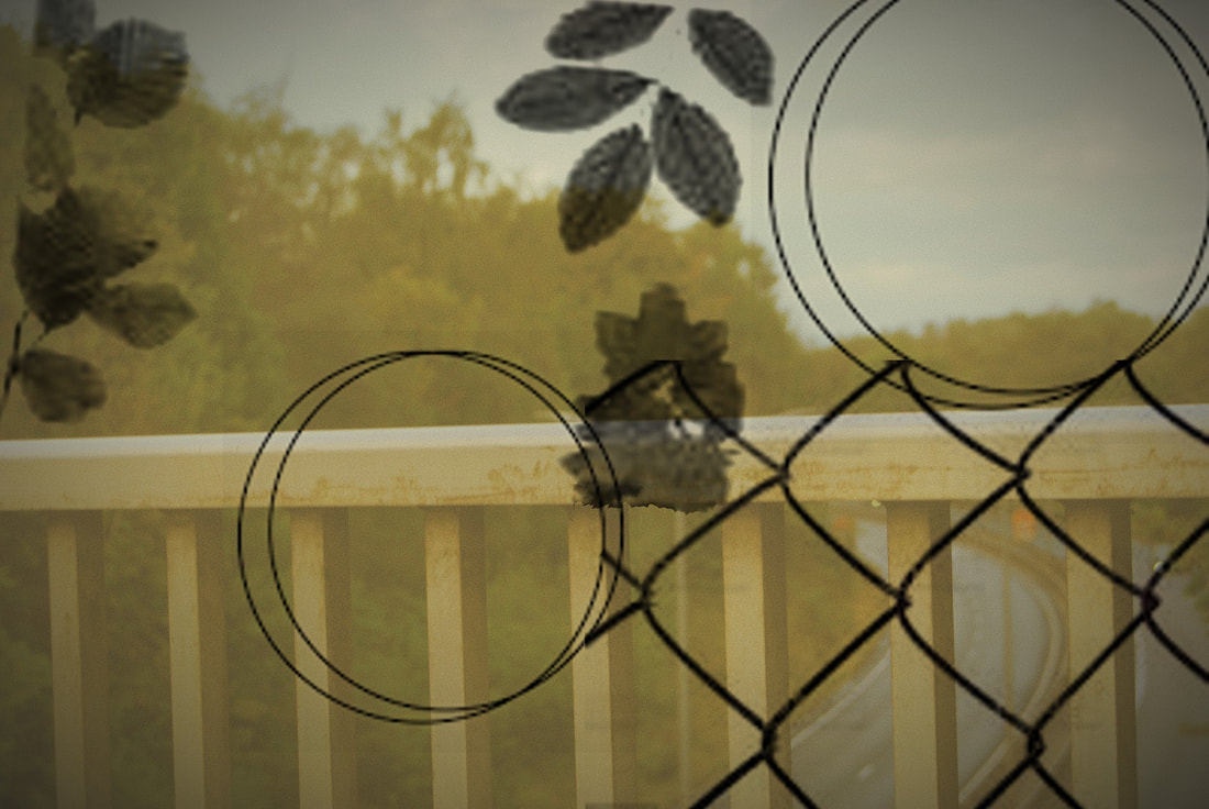
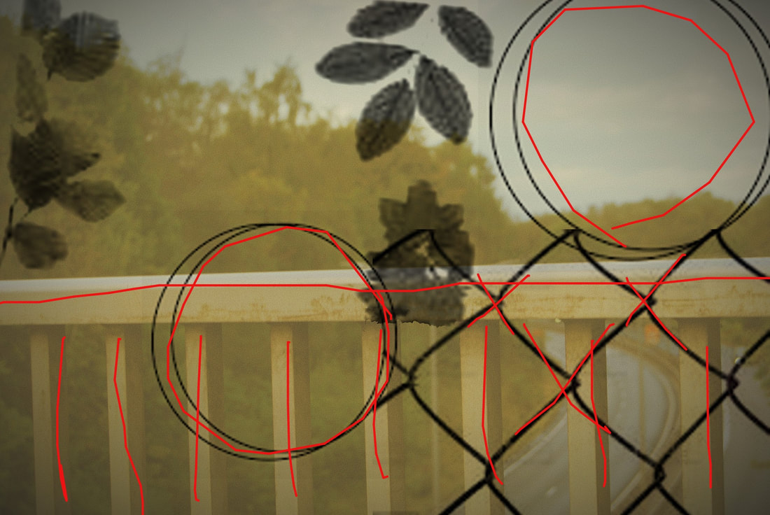
This image is the best in my composition because of the contrasting yellow and black tones, the opposing shapes, and the foggy feel to the background.
The colours create a calm, gentle theme to the image. This may influence the viewer to focus on and look more at the black, overpowering overlay. The effect of this is that the image is more interesting and holds the attention of the viewer for longer. Part of the overlay is the frontal leaves, which almost look like they are part of the background image. This creates depth to the photograph, which improves the likeness to Stephen Gill's work The leading lines in this image are present towards the bottom/middle, as the top portion of the fence and the supporting beams of said fence. The clash with each other, going both horizontally, and vertically. The crosses and diagonal lines in the fence portion of the overlay further exaggerate this effect. The circles in the overlay clash with the straight lines in the rest of the image. This increases the contrasting ideas within the image. Also, the strong focus of the fence, and blur of the background increases the structural contrast/ |
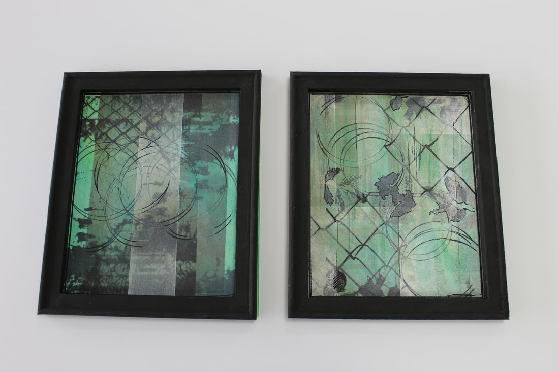
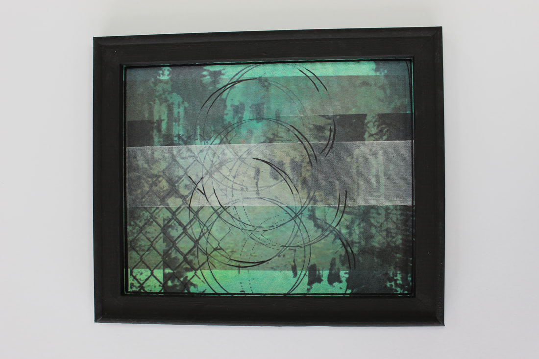
Composition 1 / physically edited piece / process


Composition 1 / physically edited piece / finished
|
|
|
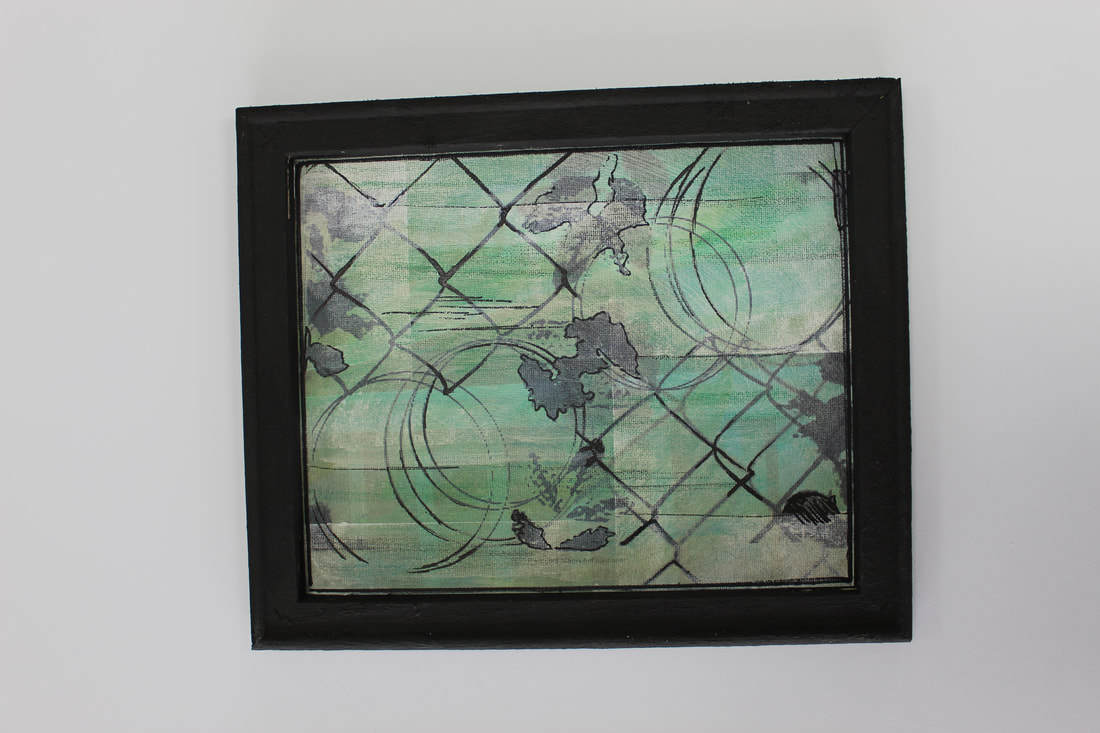
Composition 1 / physically edited piece / digital edits


Composition 2 / shoot plan
For this composition, I wish to create images full of light, which are abstract and linear. This shoot will be done in a city, and mainly indoors. I will use auto focus and a kit lens on my DSLR camera to create these images. Each image will contain leading lines and bright colours, as I like the way this type of image "pops." Depending on lighting, I will change by Aperture, but on the whole it will be at F/11. I will digitally edit these image to change the hues. Some will be blues, and others will be reds. This creates contrast within the composition.
Composition 2 / edited images
The images in this shoot are similar to the work of Steven Velleca, because of the bright colours and almost neon lighting.
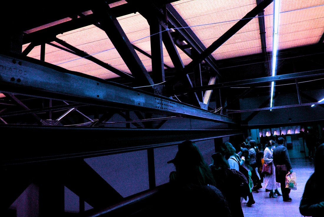
In this image I like the combination of pinks and blues. The leading lines are the metal bars and the light running down the right of the ceiling. I could be improved by changing the colours of the people's clothes who are at the right hand side.
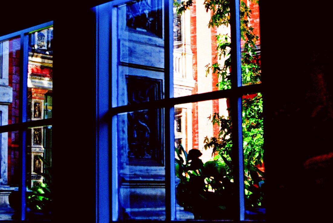
This image contains blues and reds which contrast each other. This is a positive because it creates a sense of interest for the viewer. The right side is quite overexposed, but this furthers the contrast, and creates a higher tonal range.
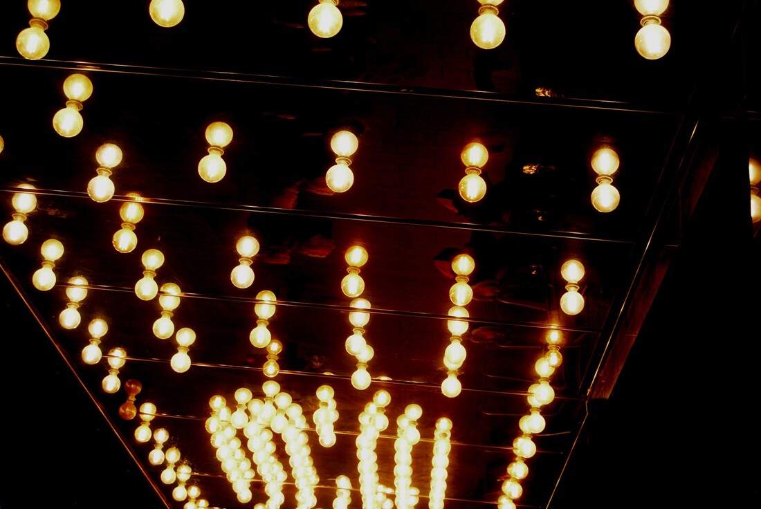
The leading lines within this image are present in the centre, and make the viewer wonder where these lights are leading to. The yellowish-whites stand bright against the black edges of this image, and this creates a framing effect. It could be improved by being taken at a different angle. as it is slightly tilted to the left.
|
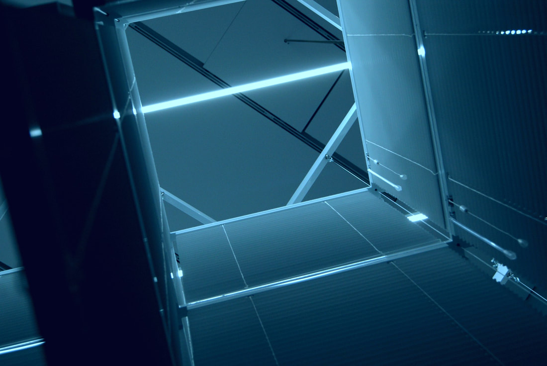
This image is very linear and bright, as I intended. I like the intense blues and whites that are present throughout the image. It could be improved by being slightly more centred. The distortion on the right corner also bothers me.
The bright and deep reds within this image make it stand out within this composition. The leading line on the left hand side alters the reflection that is shown, an creates repetition. The lack of contrast within this image creates sameness, and romanticises the image, given that all the colours are tones of red.
This image is the most successful of this composition. I love the reddish tones against the white sky, and blue reflection in the window. The edge of the building lines up with the edge of the tree, and this creates a leading line.
|
Composition 2 / editing process / final image evaluation
|
This is the original image.
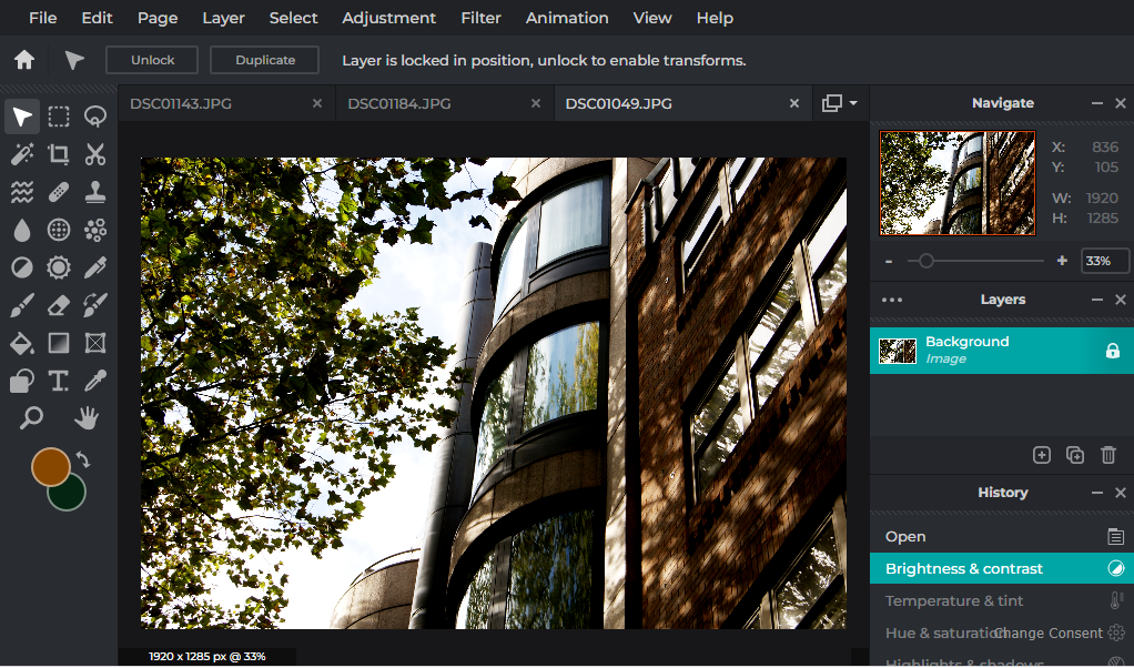
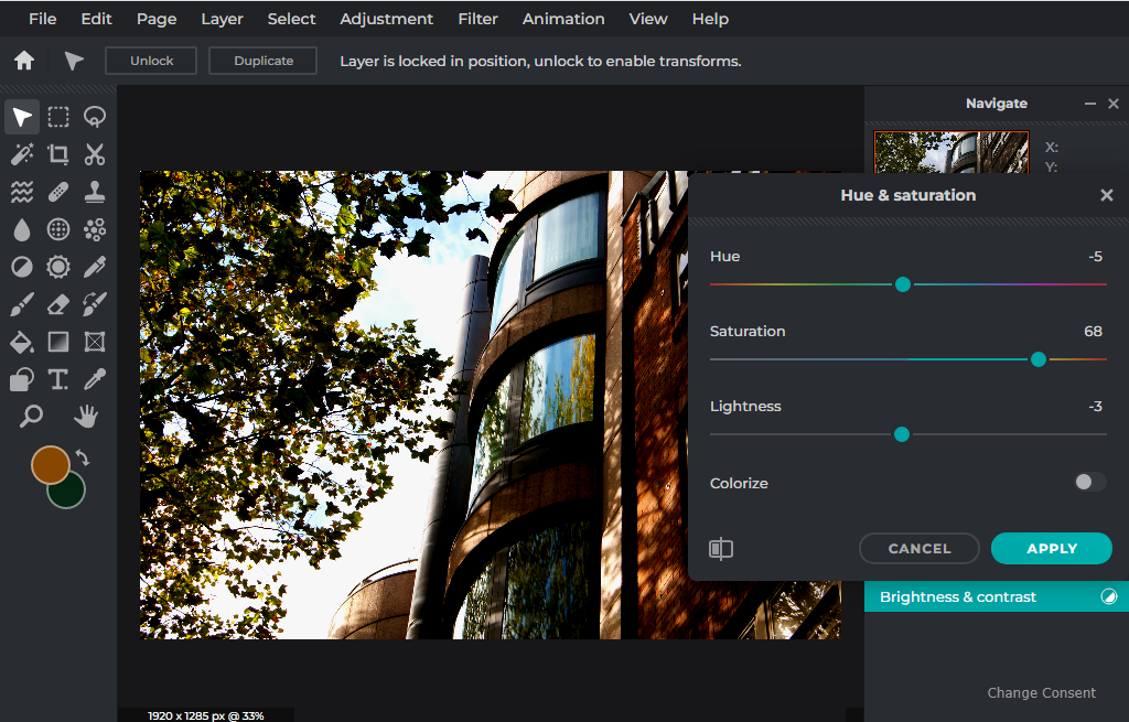
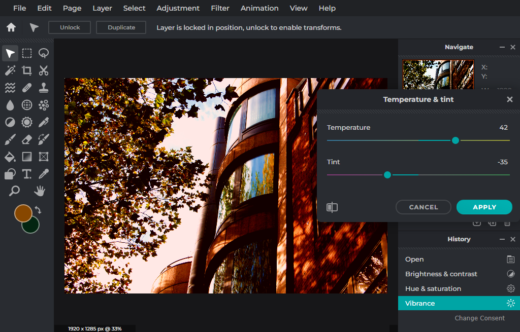
First, I increased the brightness and contrast within the image. Then I changed the hue, saturation, and lightness. This brought out the reds and oranges, and lowering the lightness slightly made the building stand out from the bright sky. Next, I increased the vibrancy which made all of the colours pop, and increased the contrast even further. Finally I changed the temperature and tint to increase the amount of red within the image. I like how there is a contrast and union in this image, the white and blue sky contrasts the reds and oranges, but said reds and oranges unionise with each other. The shadows and highlights are now more apparent due to the higher exposure and contrast. The details within the window (reflections of branches,) connect the two opposing sides of the image. 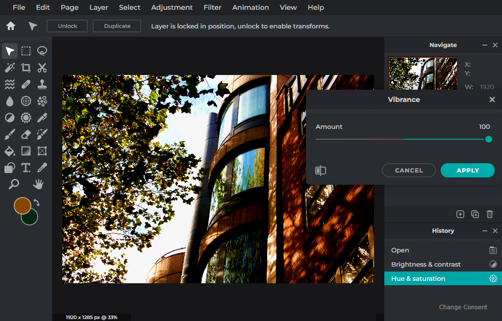
|
Evaluation / urban environment project
My work on urban environments is my best yet. I have loved this project, and have used this inspiration and motivation to create many shoots, compositions, and 1 final physical piece. I focused on the use of colour and contrast throughout this area of work.
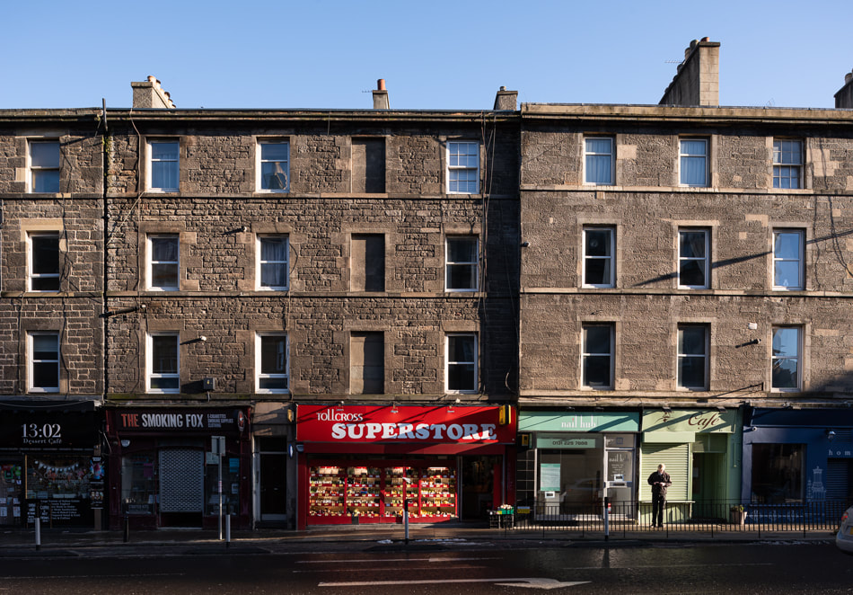
My first piece in this area of work was a shoot and study of urban landscape photography in general. In this I was experimenting with angles, centralisation, and aperture priority mode on my DSLR camera. My best image for this was the photo of a street in Preston. It contains many people, a bus down the centre of a road and a combination of buildings and trees. This image is very well focused, so people's faces, expressions, and clothes are all clearly visible. This piece of work helped to set the tone for the rest of my urban environments project.
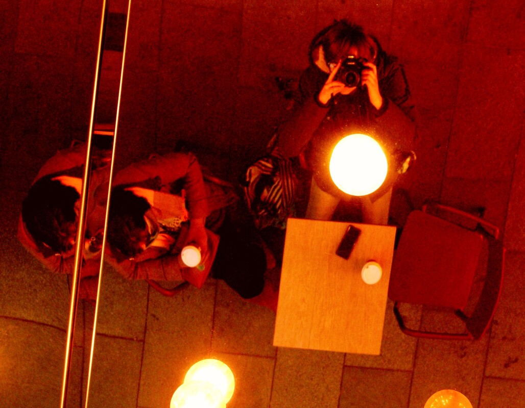
Secondly, I studied the work of Saul Leiter. Because of this study, I became very attached to the work of Saul leiter, and continue to use his work. I focused very heavily on replicating his photographs, and this influenced how and when I took my images, and still does today. I found his work very sentimental, as I connected it with the cover art of a song which I have negative but sweet memories attached to. This is spoken about with the rest of my Saul Leiter work. I also developed my digital editing skills because of this project. The best image in this study area was very interesting to shoot. I was the subject, and the photographer had to use very low angles and positions to get it right. This improved my eye for god angles, and patience, waiting for photo to be right.
Another artist study which I completed was Cocu Liu. The work of this artist is very foggy, and often contains reflections. When studying this I took notes on angles, weather, and silhouettes in photography. I did not get the chance to replicate or emulate this artist's work, but it still benefited my work on the whole.
Tomas Cambas is another artist who I studied but could not do a shoot for, so I made up for this by comparing Cambas' work to that of Saul Leiter, and Lee Friedlander This comparison was very interesting, as the three artists are all very different but contain similar qualities. Cambas' work is very bright, and geometric, Leiter's is framed, dark, and foggy, and Friedlander's is monochromatic, and contains many people, Just like that of Saul Leiter. other similarities were the vehicles present in both Friedlander's and Leiter's work, and the bright colour pops in Leiter's and Cambas' images.
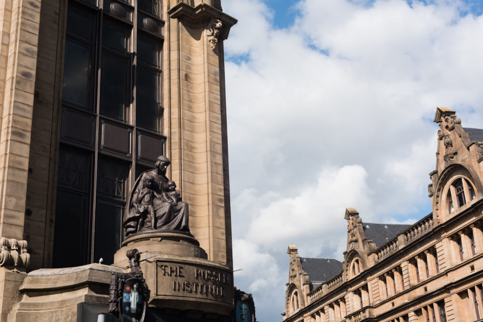
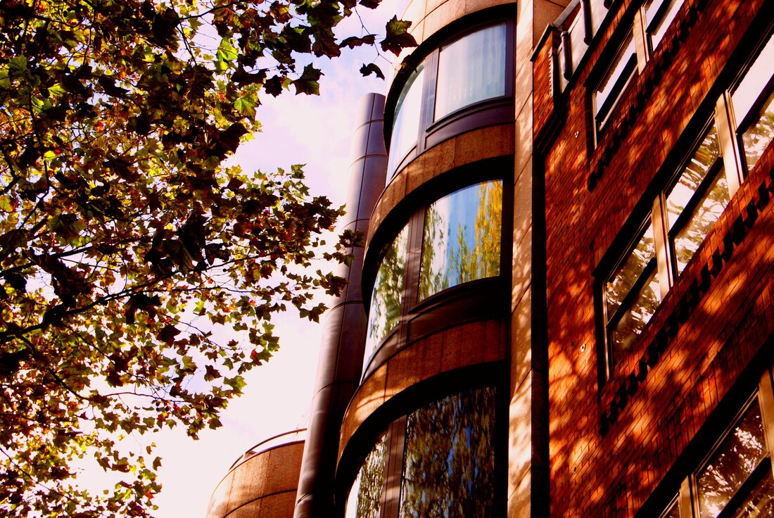
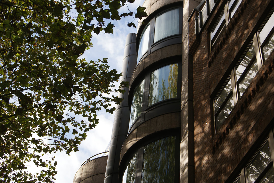
Berenice Abbot was an interesting and easy shoot to do, because of the geometric element to her work. I enjoyed spotting different sunny parts of my city, and capturing them with my telephoto lens, up close and personal. The most important part of this shoot was the straight lines which run along buildings, rooftops, and roads. This area of study improved my ability to spot and use lines within my work, an important skill for a photographer,
Inside and around my school building I took many photos, aiming to improve my ability to spot different elements of photography, such as line, light, angles, colour, shade, and many other things. This shoot became a photo safari. My best image was created using repetition, plenty of digital editing, and colour changing. I thoroughly enjoyed creating this piece, as it is something that I have created nothing like before.
My next photo safari was based on reflections. I thoroughly enjoyed doing this shoot, as it was my first one on one outing with my then new, stepdad. The images each have individual memories attached to them, and this makes them all feel very peaceful and happy to me. I loved finding angles, bits of good lighting, and colours which worked well together in this shoot, I benefited from being in a new environment.
After this, I did a second photo safari, on monochrome images. This shoot was done in Preston, using the monochrome setting on my DSLR camera. The scaffolding, sculptures, and pathways were all very interesting to me as I took this shoot. Wanting to make the images more interesting, I focused on lighting and details, because I could not rely on colour to capture the veiwers eye.
Finally, came my compositions. Composition 1 is my favourite, and is the one of which I decided to do a physical peice for. I used my DSLR camera to take gentle, light images of nature and some people, and edited them on PIXLR E, on which I changed the brightness, lightness, exposure and tint among other things. I added filters to the images to really emulate the work of Stephen Gill.
My last composition was shot in London, my images all being digitally edited to be very bright and colourful. This peice improved my editing skills, eye for colour, and my ability to improve small details of already great images. These photographs have emotional significance, as they were taken on a wonderful school trip. This puts this composition into my list of favourites overall.
My first piece in this area of work was a shoot and study of urban landscape photography in general. In this I was experimenting with angles, centralisation, and aperture priority mode on my DSLR camera. My best image for this was the photo of a street in Preston. It contains many people, a bus down the centre of a road and a combination of buildings and trees. This image is very well focused, so people's faces, expressions, and clothes are all clearly visible. This piece of work helped to set the tone for the rest of my urban environments project.
Secondly, I studied the work of Saul Leiter. Because of this study, I became very attached to the work of Saul leiter, and continue to use his work. I focused very heavily on replicating his photographs, and this influenced how and when I took my images, and still does today. I found his work very sentimental, as I connected it with the cover art of a song which I have negative but sweet memories attached to. This is spoken about with the rest of my Saul Leiter work. I also developed my digital editing skills because of this project. The best image in this study area was very interesting to shoot. I was the subject, and the photographer had to use very low angles and positions to get it right. This improved my eye for god angles, and patience, waiting for photo to be right.
Another artist study which I completed was Cocu Liu. The work of this artist is very foggy, and often contains reflections. When studying this I took notes on angles, weather, and silhouettes in photography. I did not get the chance to replicate or emulate this artist's work, but it still benefited my work on the whole.
Tomas Cambas is another artist who I studied but could not do a shoot for, so I made up for this by comparing Cambas' work to that of Saul Leiter, and Lee Friedlander This comparison was very interesting, as the three artists are all very different but contain similar qualities. Cambas' work is very bright, and geometric, Leiter's is framed, dark, and foggy, and Friedlander's is monochromatic, and contains many people, Just like that of Saul Leiter. other similarities were the vehicles present in both Friedlander's and Leiter's work, and the bright colour pops in Leiter's and Cambas' images.
Berenice Abbot was an interesting and easy shoot to do, because of the geometric element to her work. I enjoyed spotting different sunny parts of my city, and capturing them with my telephoto lens, up close and personal. The most important part of this shoot was the straight lines which run along buildings, rooftops, and roads. This area of study improved my ability to spot and use lines within my work, an important skill for a photographer,
Inside and around my school building I took many photos, aiming to improve my ability to spot different elements of photography, such as line, light, angles, colour, shade, and many other things. This shoot became a photo safari. My best image was created using repetition, plenty of digital editing, and colour changing. I thoroughly enjoyed creating this piece, as it is something that I have created nothing like before.
My next photo safari was based on reflections. I thoroughly enjoyed doing this shoot, as it was my first one on one outing with my then new, stepdad. The images each have individual memories attached to them, and this makes them all feel very peaceful and happy to me. I loved finding angles, bits of good lighting, and colours which worked well together in this shoot, I benefited from being in a new environment.
After this, I did a second photo safari, on monochrome images. This shoot was done in Preston, using the monochrome setting on my DSLR camera. The scaffolding, sculptures, and pathways were all very interesting to me as I took this shoot. Wanting to make the images more interesting, I focused on lighting and details, because I could not rely on colour to capture the veiwers eye.
Finally, came my compositions. Composition 1 is my favourite, and is the one of which I decided to do a physical peice for. I used my DSLR camera to take gentle, light images of nature and some people, and edited them on PIXLR E, on which I changed the brightness, lightness, exposure and tint among other things. I added filters to the images to really emulate the work of Stephen Gill.
My last composition was shot in London, my images all being digitally edited to be very bright and colourful. This peice improved my editing skills, eye for colour, and my ability to improve small details of already great images. These photographs have emotional significance, as they were taken on a wonderful school trip. This puts this composition into my list of favourites overall.
