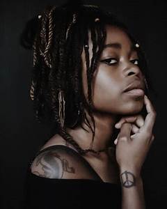
Portraiture And Identity
|
|
|
|
|
“In a portrait, I’m looking for the silence in somebody.” |
I find this quote inspirational to the project because it expresses how much a person hides beneath their voice, and how it should be celebrated, through capturing it in an image.
|

|
|


|
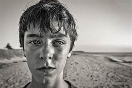
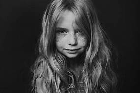
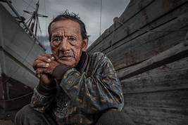
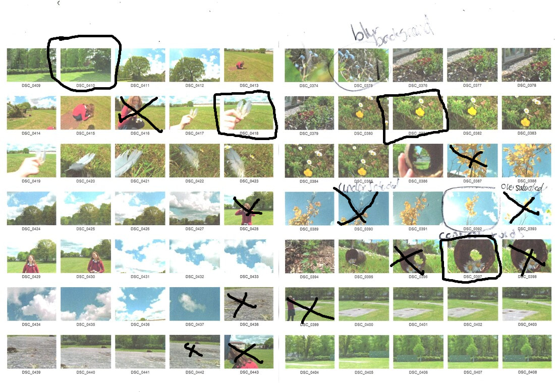
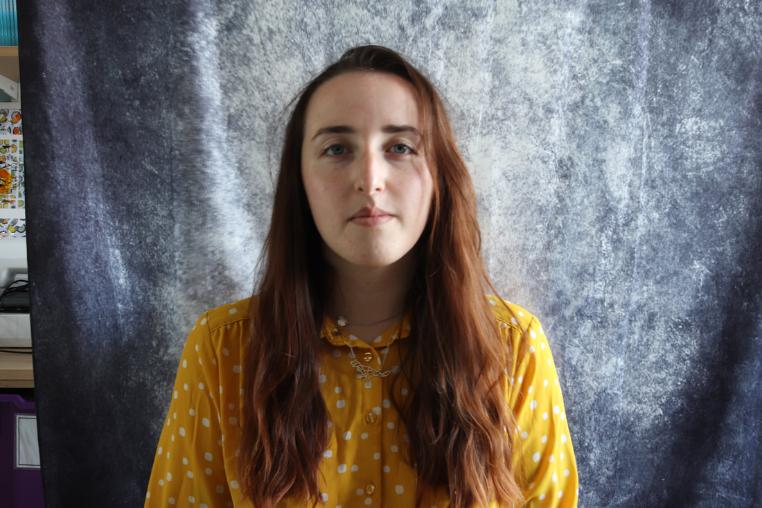
In the past, I have researched portraiture by completing knowledge organisers and taking part in a shoot, in which we looked at different types and angles of lighting. During this shoot we ensured the subject had good back and hand posture, making sure that the image would look its best. Also, we learned that Mr Dever is a professional freelance photographer, this helped to inspire the group. This shoot was done between 12:15 and 01:10 pm, to get the best ambient lighting. Additional lighting and equipment was used such a a soft box, reflectors, and a studio light. To ensure confidentiality, we only used the initials of the model to name the images, and after the shoot was printed, we covered the eyes of the model with black pen. Social distancing was difficult, so everyone who is not exempt wore face masks, and the entire group used hand gel between turns. Trip hazards were a problem, so our teacher warned us about wires and other potential hazards, many times throughout the shoot. From the shoot, I learned many different lighting types, such as fill, key, and back lighting. |

|
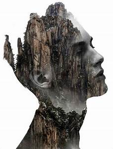
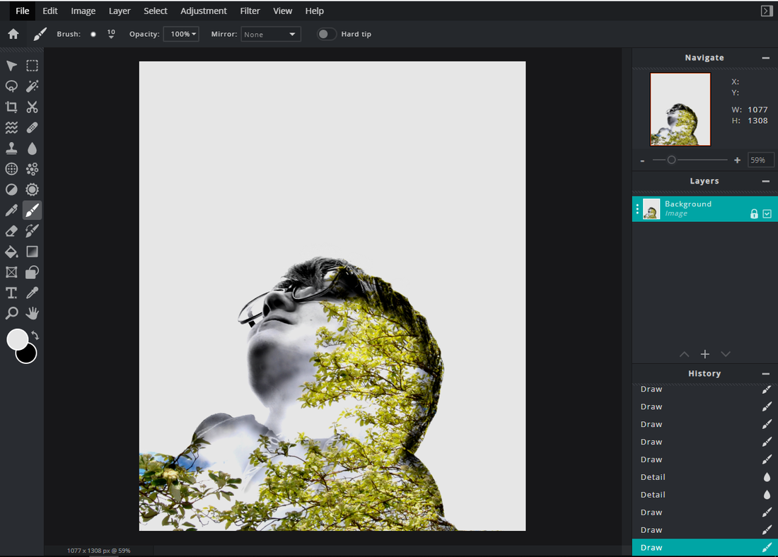
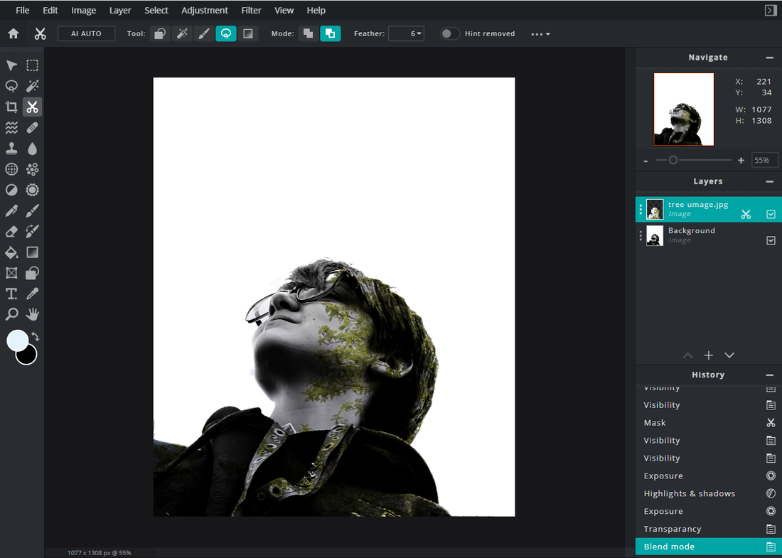
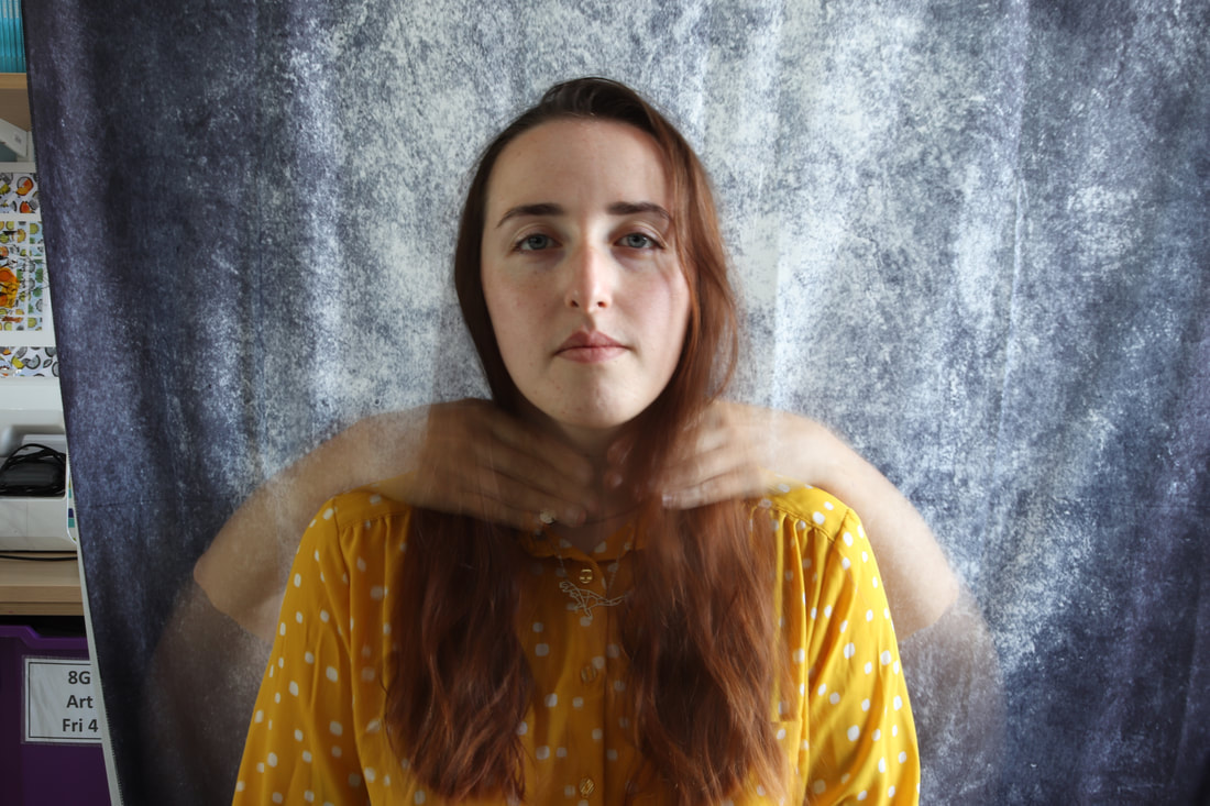
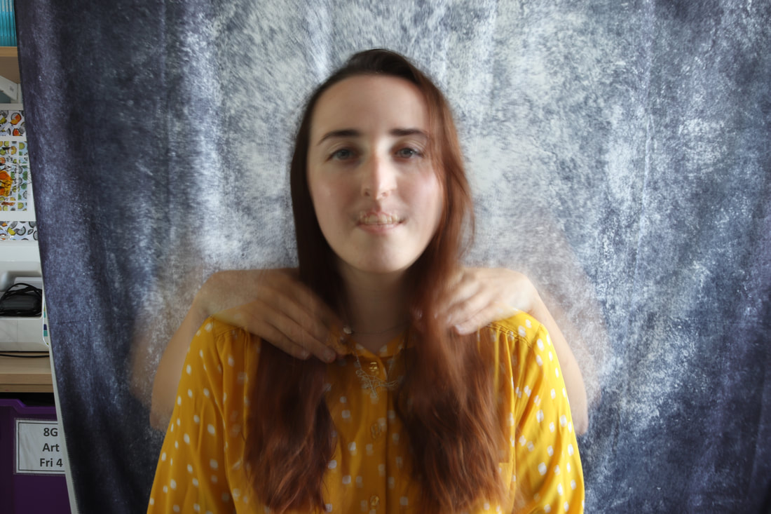
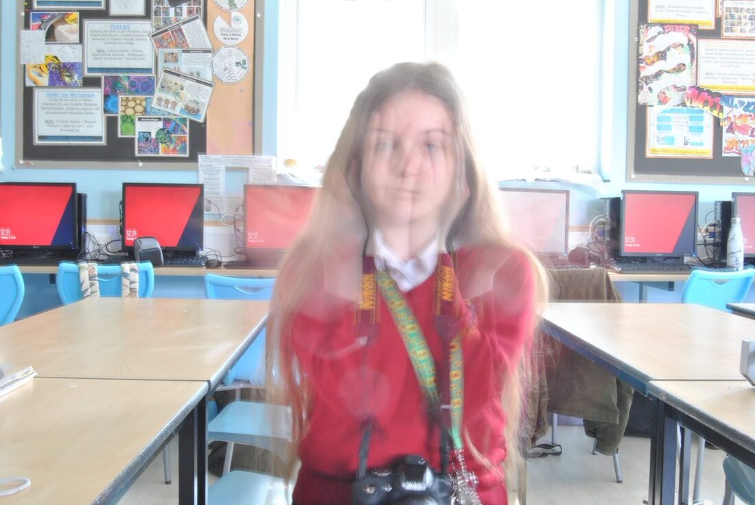
Double and multi exposure photography is when 1 or more images is layered on top of another, with gaps to see the lower image. These are often done with people and nature, but other images can be used to give different moods to the image.
Double exposure started as a way to give the effect that someone has a twin, then evolved to suit our community today. multi exposure is used to created moods and meanings within an image. Each one has its own feel and personality to it, making this type of photography meaningful and versatile. |

|
|
|
|
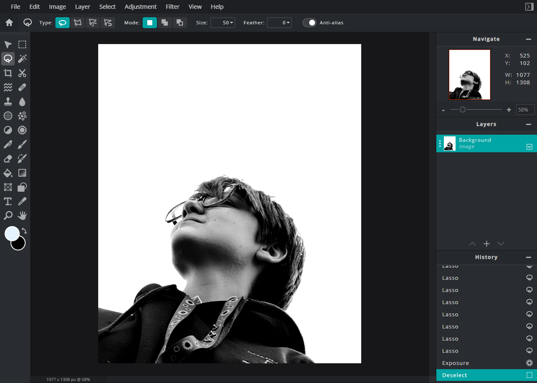
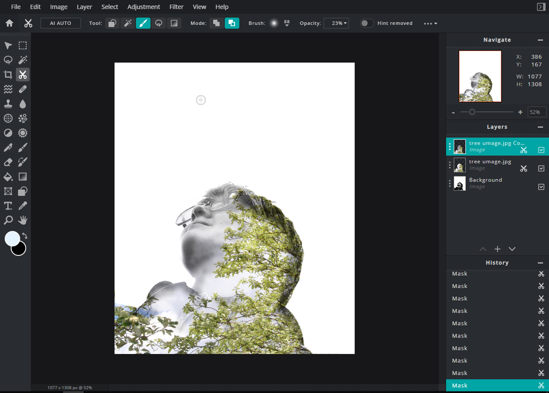
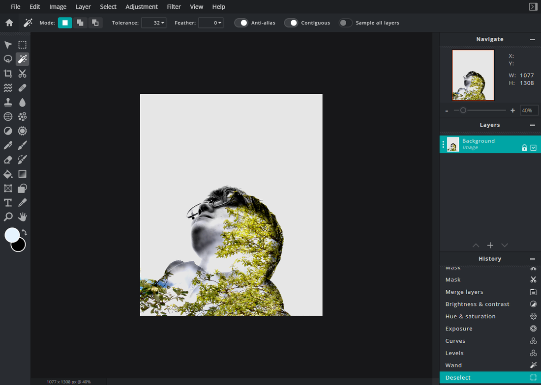
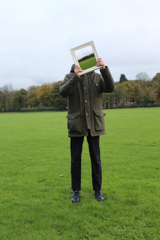
I improved the image by cropping the edge, and I think further improvement could be done by expanding the image at the top, to show the full head. Another possible improvement could be the placement of the tree within the face. It would look better if it was further up, not covering the eye so much. From this process I learned that cropping an image changed the entire mood and feel of it, and how to use PIXLR to create a double exposure image. |

|


|
Image Evaluation
I used 3 separate images from the same shoot to create this final image. I like how the dark greens stand out against the sunny background, and how you can see the buildings through the leaves, although it could be improved by fixing the lighting between the images. I like how the statue's clothes blend through into the person's, my Grandad, clothes. It gives a stony effect, which could represent my Grandad's inability to show much emotion.
|

|
Shoot Plan:
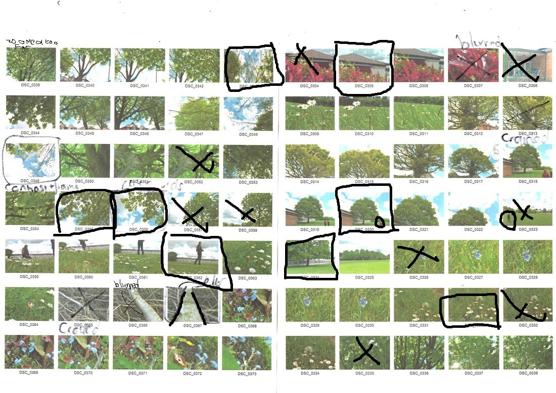
In this shoot I was inspired by natural forms and weather patterns. I love how leaves move against the sky in a windy day. This fuelled some of my images in this shoot. The shoot was done outside, on my school field. Props were only what I found outside, and the camera, which was a compact. the lighting was purely from the sun, and the shadows that it created. After the shoot I edited some an d used them for a double exposure shoot. The weather was bright and sunny, and I used a Compact camera. |
Firstly, I cropped the image, and put it into black and white.
I then changed the blend mode to fit the theme of portraiture, the one I chose darkened the face and brightened the empty space.
I got some advice from my teacher, and eased some of the overlay image to create a better tonal range, and to highlight areas more. I brought back some of the tree, and a small area of the sky, which added more colour and warmth to the image.
|
Then, I added on the second layer of the image, placing it in the correct spot and changing the saturation, exposure, brightness, ect.
After that, I further darkened the image, highlighting the facia features and changing the exposure a second time.
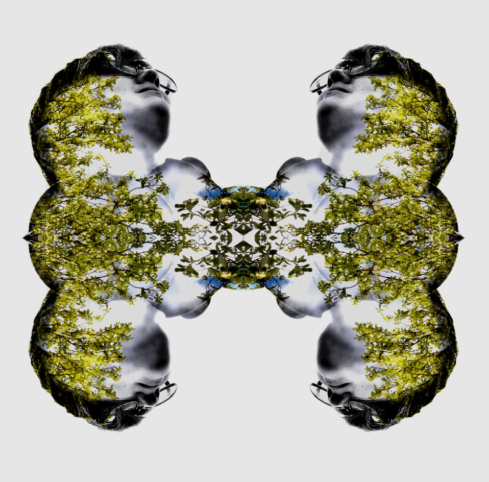
Finally, I erased the lower sections of the image to create a broken effect, and changed the levels a final time. After this, I repeated and rotated the image to create the final piece.
|

|
Best Image Evaluation:
Earlier, this set of images was blurry and messy. Since editing them further, and changing my images, they have improved greatly. I like the autumnal feel of the of the orange image, it makes it feel very calm. It could be improved by lowering the exposure of the subject, and increasing the contrast, to show more details. The opposing pink and blue versions of this image work very well together in my opinion.
|

|
|
|
I chose this artist because her art is easy to emulate, although still beautiful, and has meaning. I found that the image on the bottom row, second from the left, was taken in a town I have been to, Bruges, Belgium. It is possible that it is the same bridge we walked over, and this makes the image feel very familiar and safe. This image also has a good dynamic range, due to the dark trees and bright sky in the background. The image has a small focal length and a low ISO. A short exposure must have been used to prevent the model's hair from moving during the photograph. I could emulate her images by taking a mirror into the woods, or even garden, and hold it out while stood behind a tree or something similar, This would be an emulation of the image on the top row, 1st on the left.
William's website is https://laurawilliamsphotography.co.uk/ |

|
|
|
|
|
|
Best Image Evaluation:
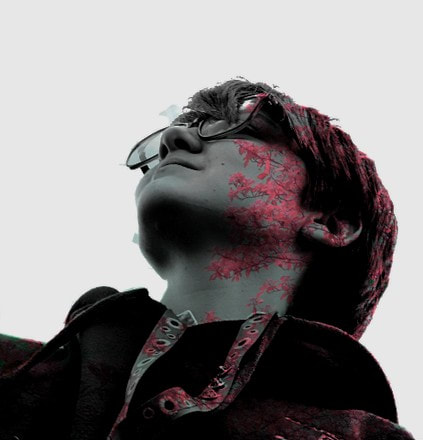
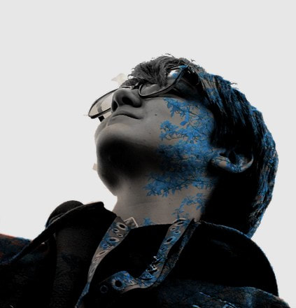
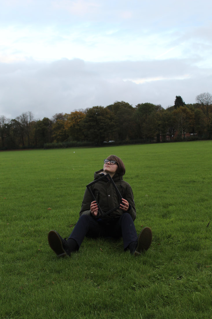
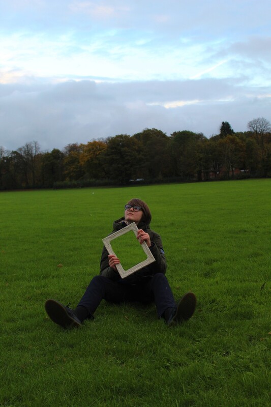
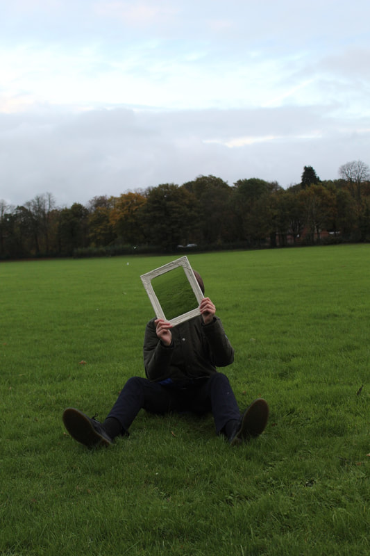
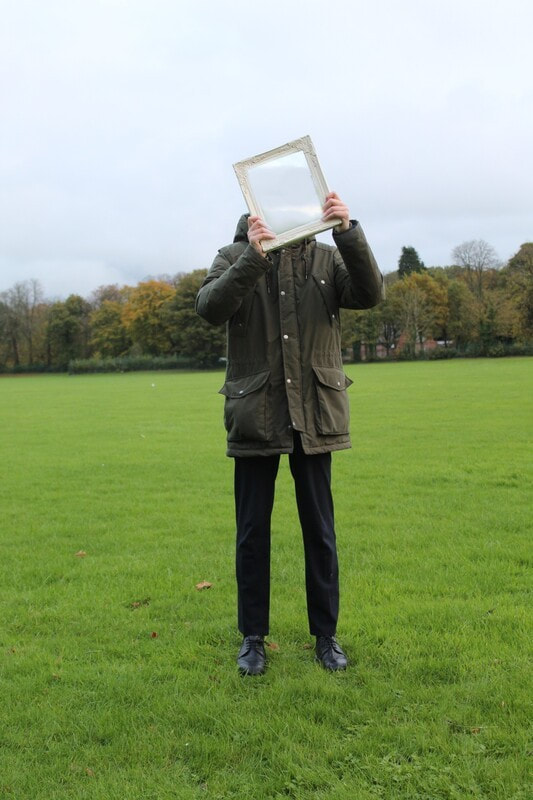
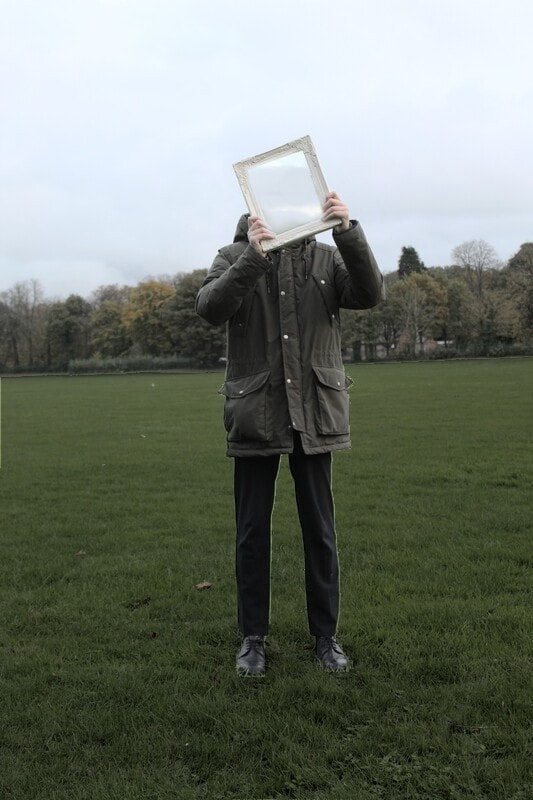
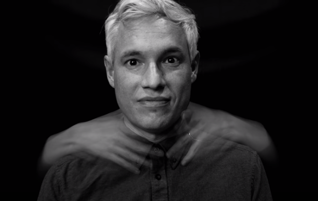
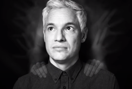
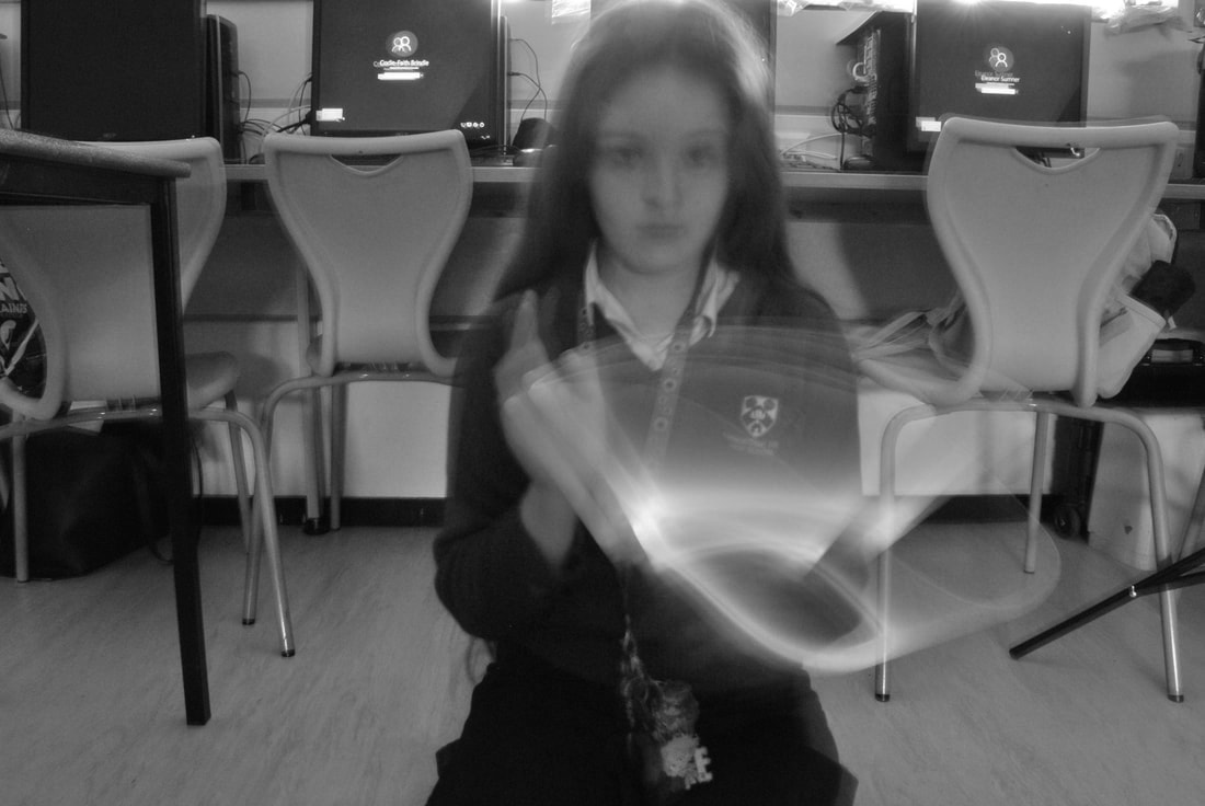
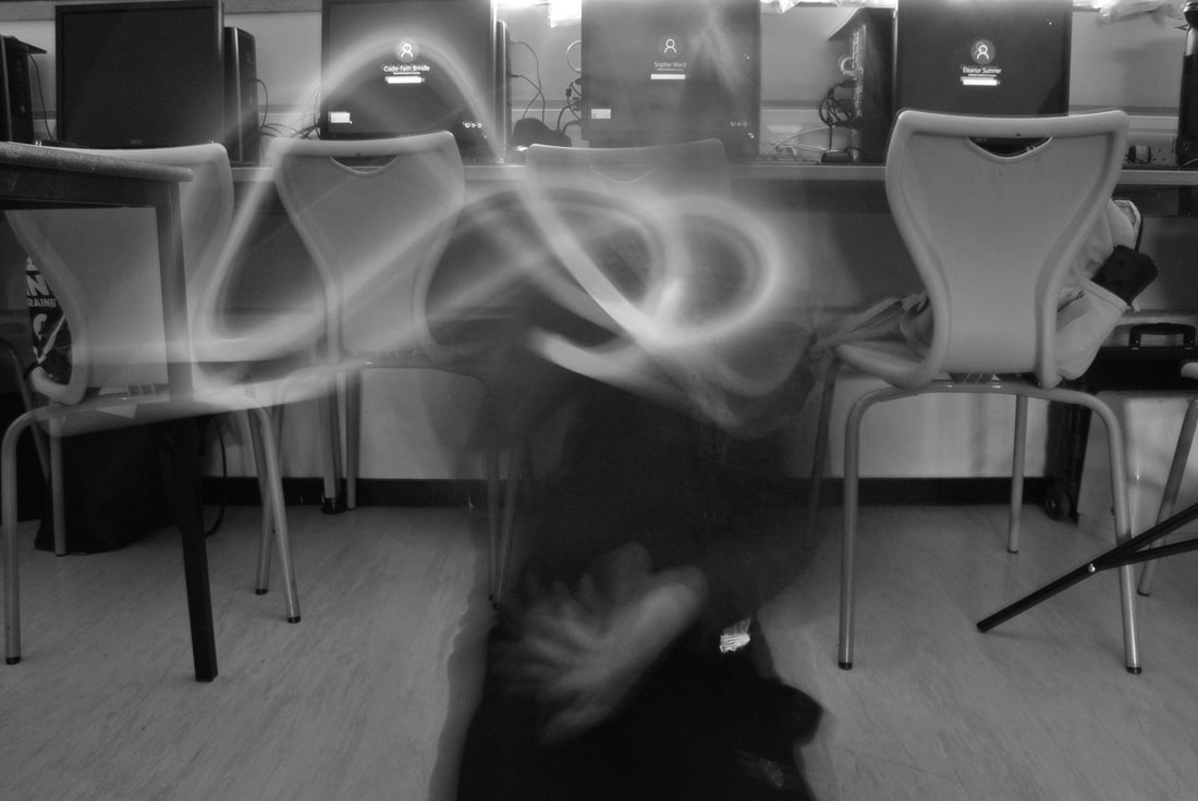
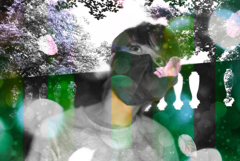
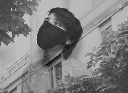
This image went well because of the editing of exposure, lighting, and the double exposure. I particularly feel the elements of composition and balance are successful. I see that there is a theme of deep greens throughout the image. This creates the idea of sadness and melancholy. Also, the feeling of human emotion and nature being intertwined. By physically removing the subjects identity I have brought a greater meaning to the portrait by hiding the most recognisable part of a person. Identity is shown by the hiding of the face. This created the idea that the subject is hiding, and feeling invisible. The way that the subject is holding the frame himself symbolises that he is the on isolating himself, and being invisible is the consequences of this own actions. I like the neutral greens within this image because the entire thing is made up of them. They call work well with each other, and complement each other. The dark blue of the subject's trousers, and black shoes, stand out against the rest of the greens, which creates a sense of importance. This makes the image an oxymoron to itself, as the subject is hiding his face, making him seem unimportant. |
|
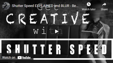
What is Shutter Speed and Blur in Photography?
Shutter speed is the length of time that the camera lets in light. A high shutter speed results in a low exposure. Safe shutter speed is impacted by lens type. Short shutter speeds are sued for sharp images, such as a bird flying, or person jumping. Longer shutter speeds are used for images such as a car driving along a still road or a stream running through a still forest. A macro lens would not be as good for long exposure photography as there is no room for movement due to the zoom. |

|
|
|

|
|

|
|
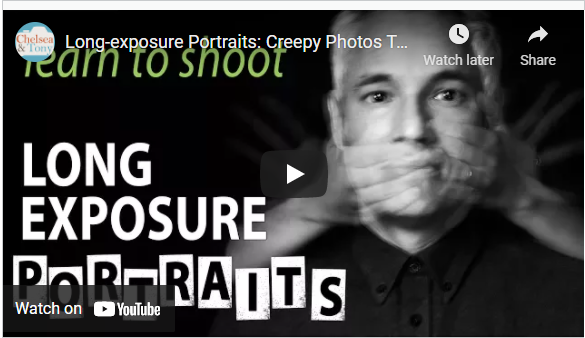
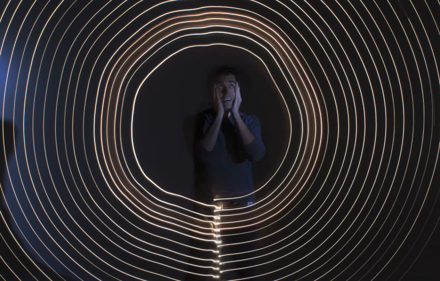
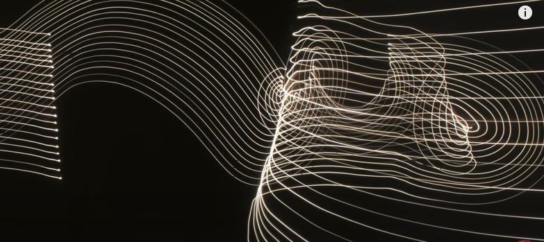
What is Long Exposure in Portrait Photography?
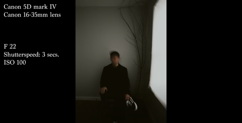
Add in video & link in Re-Watch the video & type up your findings on long exposure Use this video & PowerPoint from week 9 to explain the equipment / camera settings required for Long Exposure Photography Take 3 snips of your favourite examples from the video and label up Aperture/shutter/ISO |

Aperture f/14
Shutter Speed 3" (seconds) ISO 64 |
Aperture f/11
Shutter Speed 3" ISO 64 |
Aperture f/16
Shutter Speed 3" ISO 64 |
|
|
|
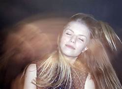
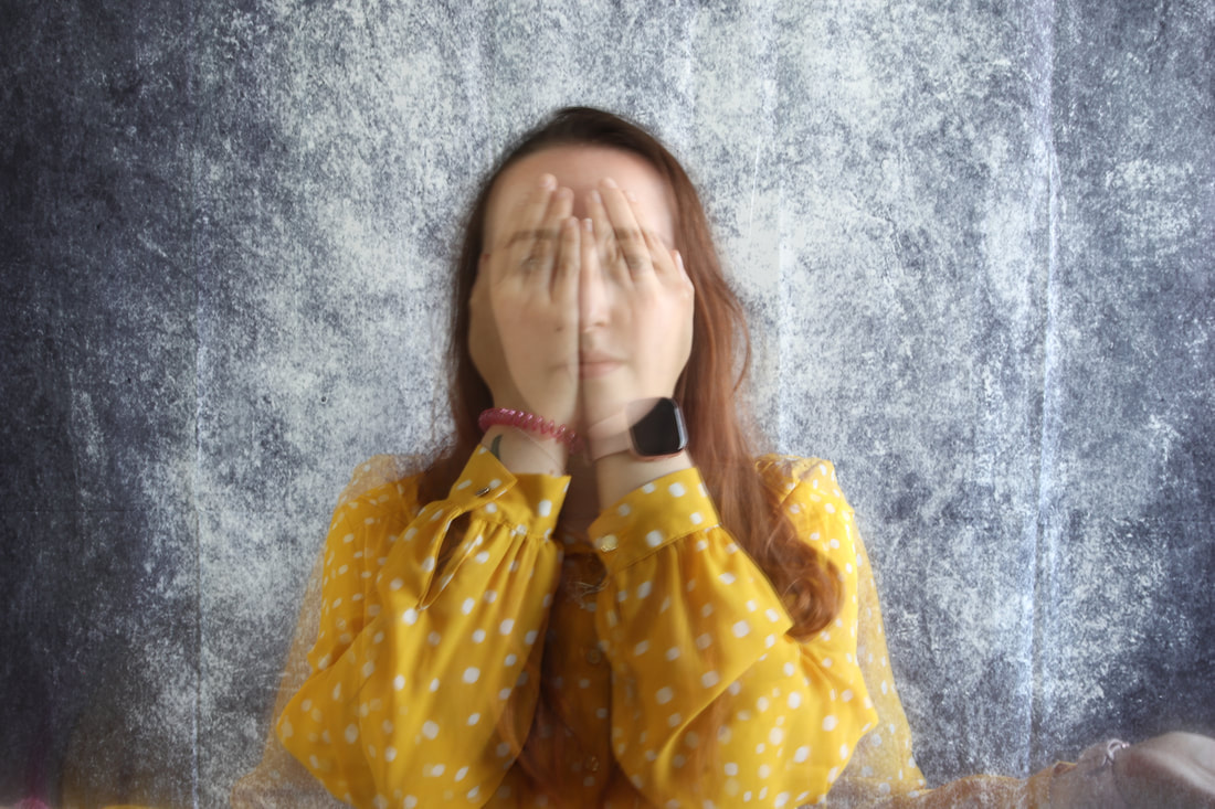
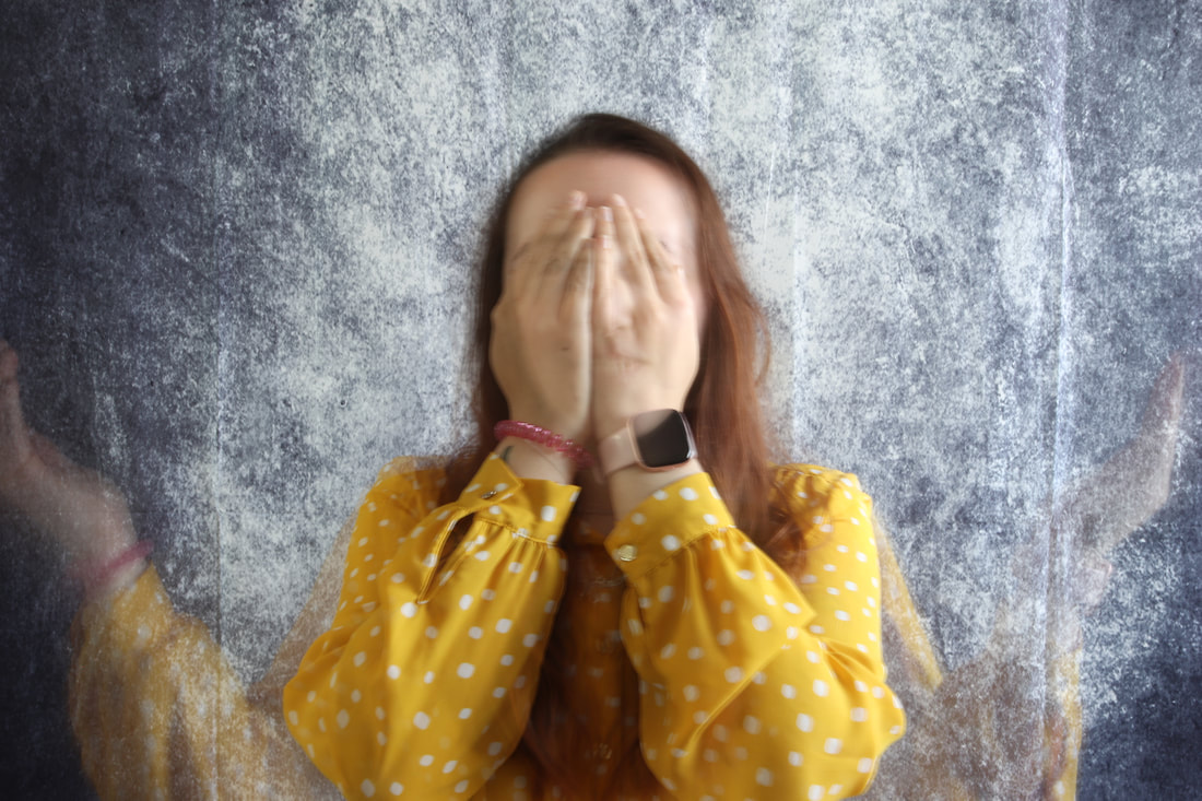
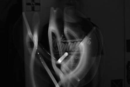
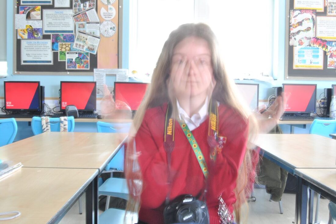
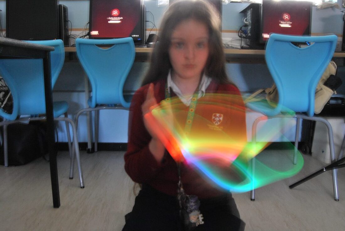
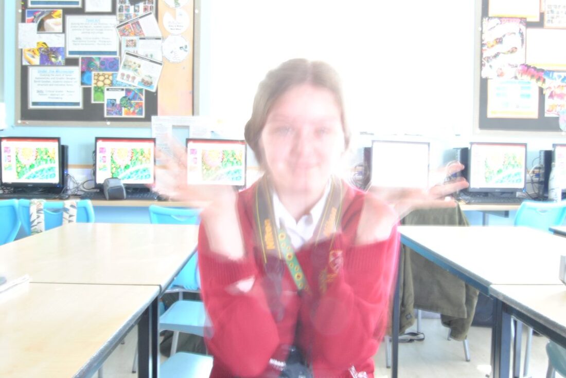
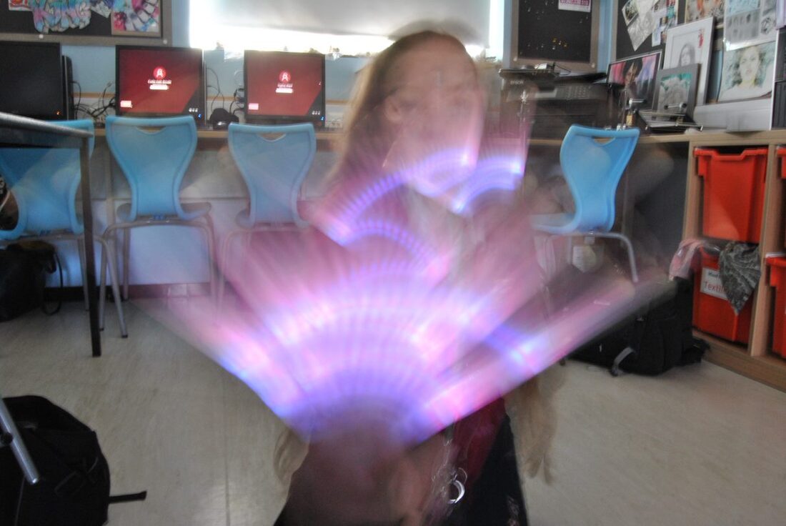
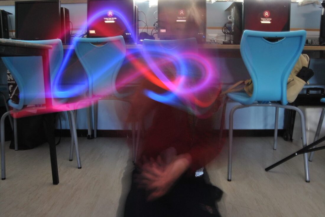
I like the blur of the face in this image, and the shape of the coloured blur. It could be improved by the camera being held still.
|
|
|
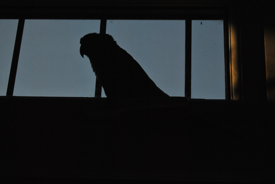
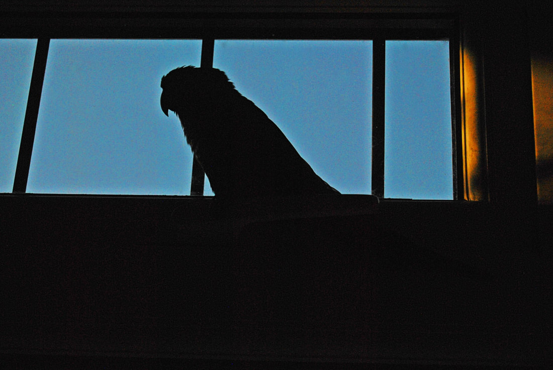
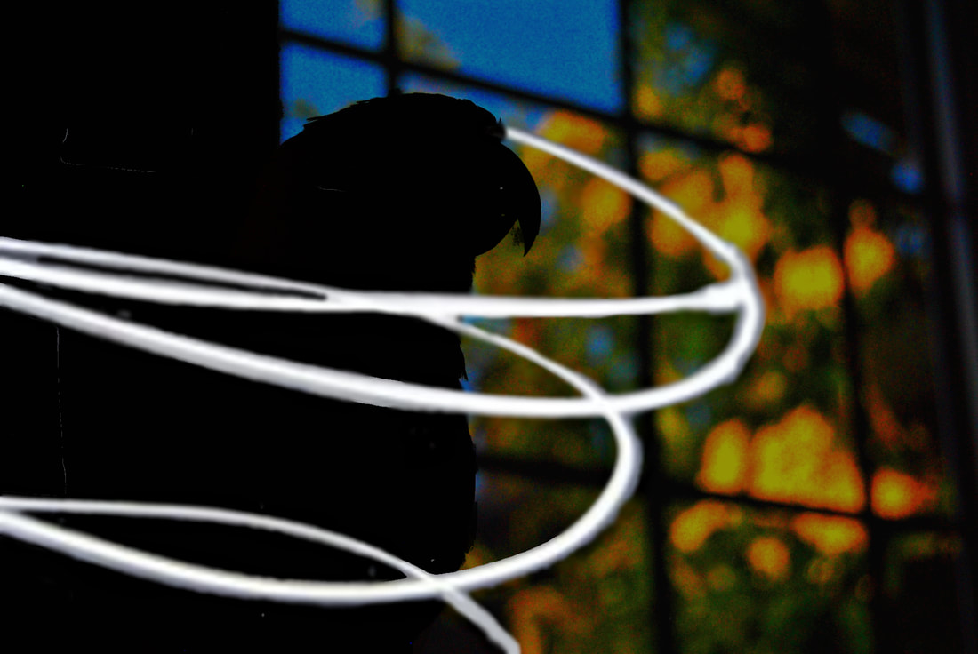
I like how moody and mysterious the image is. I edited the image by changing the exposure, removing spots from the background, and changing the vibrancy. Mood is expressed by the contrast between the bright blue and yellow background, the difference between dark and light is quite interesting in an image. The bird has its back turned to the bright yellow, which further exaggerates this.
|

Aperture F22
Shutter Speed 2" (seconds) ISO 100 |
Aperture F22
Shutter Speed 3" (seconds) ISO 100 |
Aperture F22
Shutter Speed 0.5" (seconds) ISO 100 |
|
|
|

Aperture F14
Shutter Speed 14" (seconds) ISO 100 |
Aperture
Shutter Speed ISO |
Aperture
Shutter Speed ISO |
|
|
|
On this image I changed the exposure, brightness, and contrast. I also removed some of the white lines, and darkened parts of the bird to remove detail. I blurred the background to create depth.
|
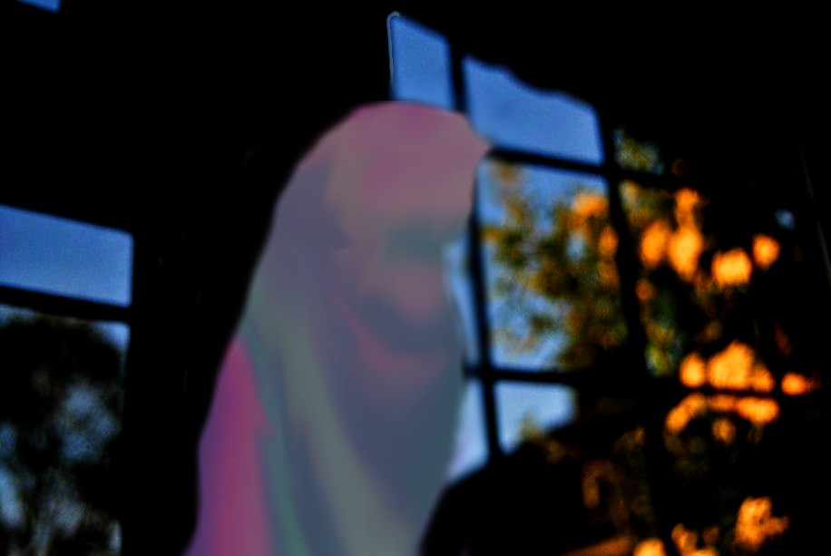
For this image I blurred the background, changed the brightness and contrast, and removed unneeded parts of the bird/black. after this, I drew some colours onto a separate layer, and used the liquify tool to move them around. I then placed this layer above the bird and erased where needed.
|

|
Best Image Evaluation:
Explain your successes and limitations to your best image from this workshop. How is identity/mood expressed in this portrait? Identification / personality / mood / subconscious / dual or split personality / hidden psyche / expressive / non-verbal discourse / visually articulates / symbolises / represents / portray / purport / disfigures / reveals / subvert / exposes |

Aperture f/16
Shutter speed 23s ISO 100 |
Aperture f/16
Shutter speed 24s ISO 100 |
Aperture f/18
Shutter speed 12s ISO 100 |

|
|


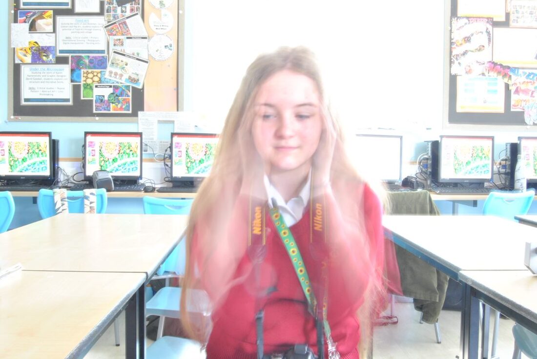
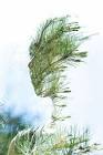
This image can be seen further up in my portfolio, as an example of double exposure photography. This image stands out to me because of the nature and person within the image. The contrasting tan coat and bright flowers are also interesting to me.
|

I want to emulate Byrne's images because of how calm, and nature-orientated their images are. Each image is its own sense of calm, showing that beauty is fluid. This is something that I want to create in my own work. As a person who takes Geography GCSE, using natural forms within my identity images bring me closer to my work, and joins my passion, geography, with my photography. I want to feel connected to my work.
faceless portraiture, to me, uses different but identifiable parts of the body to create identity. For example, hands, arms, and hair. My style of Byrne's work will involve the use of natural forms, for example trees, flowers, and clouds, and the use of body parts such as hands and arms.
|
In this project I will combine the use of abstract nature and portraiture, using long and double exposures. Using work from Sara K Byrne, I will create a bright but gentle composition that reflects me as a person. I wish to use faceless portraiture to my advantage, as I do not have much access to people who are willing to show their faces.
|
|
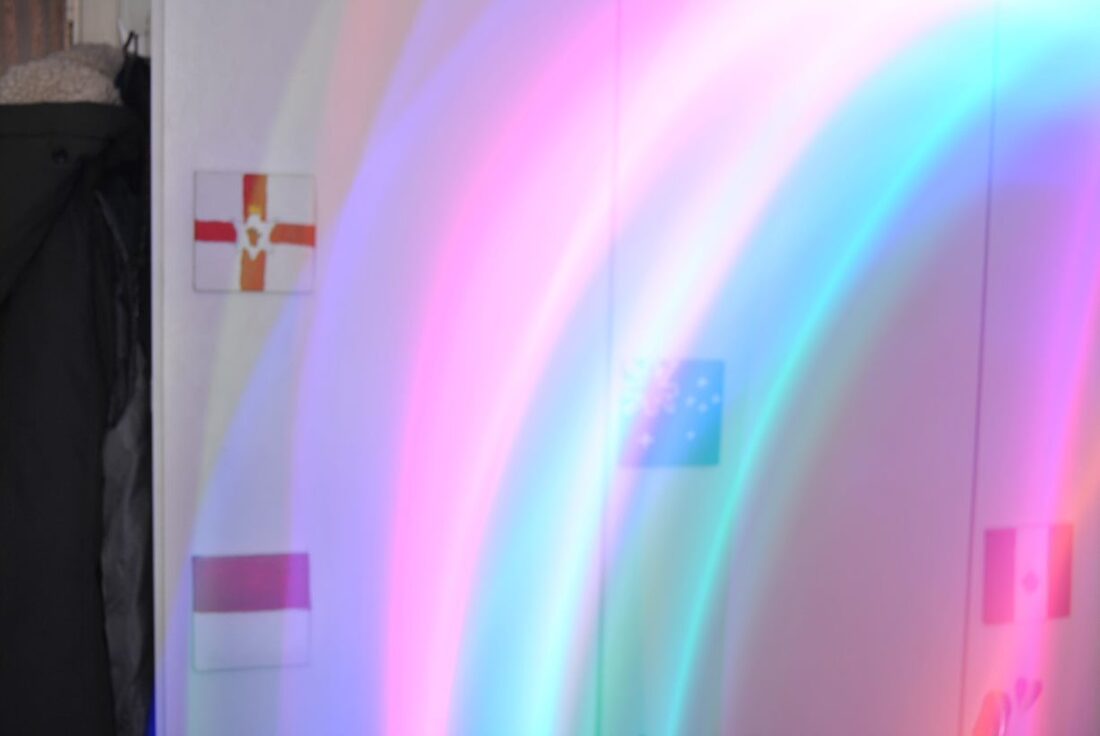
What is the aim of this shoot?
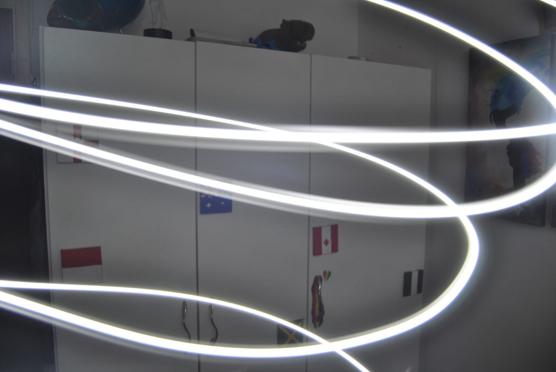
The aim of the shoot is to create a calm, beautiful atmosphere using double exposure. I plan to use colours that are the same as flags, to express concepts such as gender dysphoria, gender envy, and asexuality and aromantic feelings. |
“When words become unclear, I shall focus with photographs. When images become inadequate, I shall be content with silence.” |
|
|
What photographer and what technique do you want to combine for Composition 1:
I want to emulate Sara K Byrne's work in my work, because of the stunning yet serene images that she creates. I want to use double exposure to create my work, as it brings nature and humanity together. This brings identity because colours and patterns can be used to create flags, and designs. |


Gay flag designI like this image because of how the blue/green tones work against the background
Transgender flag designI like the stripes of black and white in this image, as it creates new tones
|

Asexual flag designI like the contrast in this image, between the subject and bokeh effect.

Aromantic flag designI like how full this image is, and how the bright colours work with the white sky.
|
|
Eberhard Grossgasteiger is an Italian artist to takes photographs of flowers and trees. A lot of his work is taken at night, against the beautiful, star-filled skies. The work often features coniferous trees, and mountains. These images are brilliant for double exposure edits. His work has inspired some of my images, especially the ones of flowers. Before learning about Grossgasteiger, I set one of his images as my phone background. This is what has drawn me to his work. This image is the top right corner of the gallery, shown to the right. Other favourites of his are the sunflower images, in the middle row of the same gallery.

|
|
|
I find this image, shown below, so incredible because not only is the model perfectly in focus and lit, but so is the sky. Every star is bouncing off the image, creating a stunning background, Depth is created by the rope, running down the left hand side of the image, and the rocks in front of the subject.

|

|
|
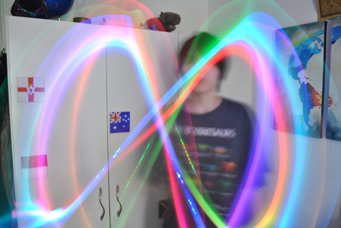
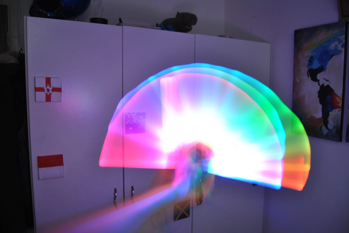
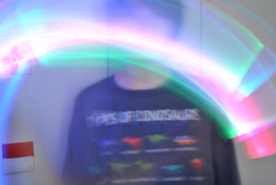
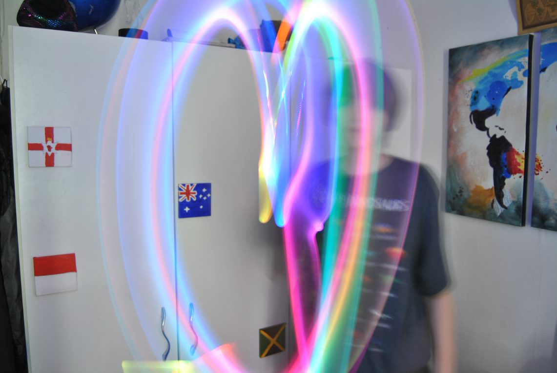
What is the aim of this shoot?
This shoot is based on light. The images I have taken so far, were done using a coloured light. I will edit these to improve the brightness, contrast, and white balance, then some of them onto a double/multi exposure image. |
“Everything that you can see in the world around you presents itself to your eyes only as an arrangement of patches of different colours.” – John Ruskin |

|


|

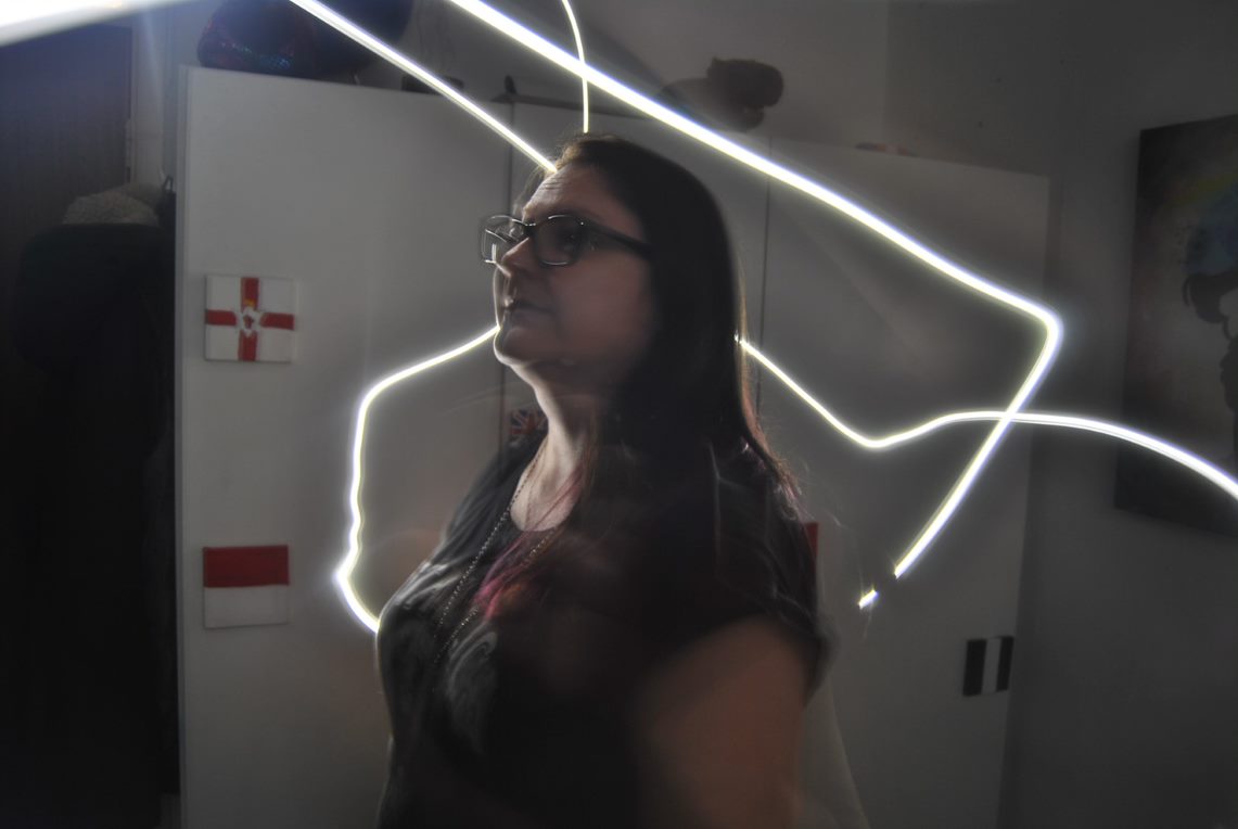
In this image I like how the face blends in with the background, although the editing could be improved. The exposure isn't right, as parts of the image are black and others are overexposed.
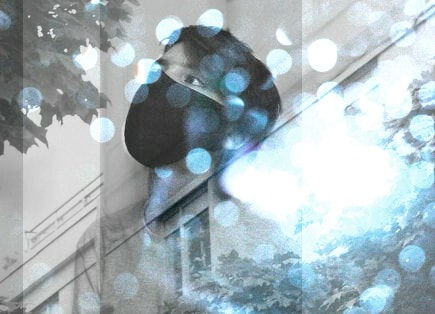
High contrast design
Monotone designI really like the looming shadow in this image, although it is slightly underexposed. I like how the subject and background blend together, and how there are leading lines, making the veiwer see the image from bottom left to top middle/right.
|

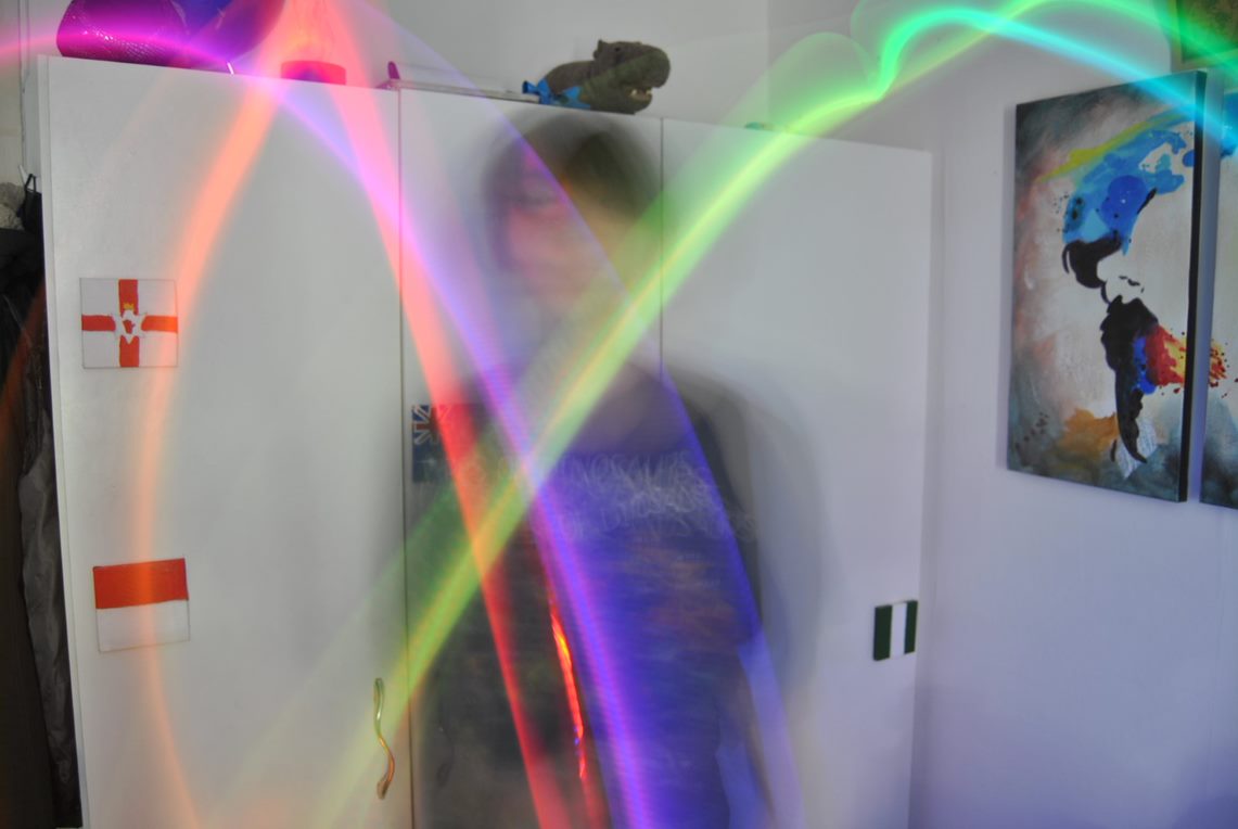
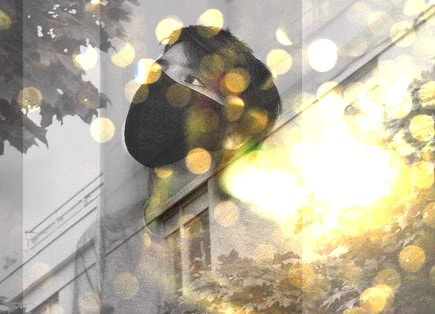
This is my favourite image of the shoot, I love the colours and how the double exposure worked out. The contrasting yellows and blacks work well with the dark yellows. The window on the subject's neck gives depth and further detail.
Double exposure design
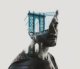
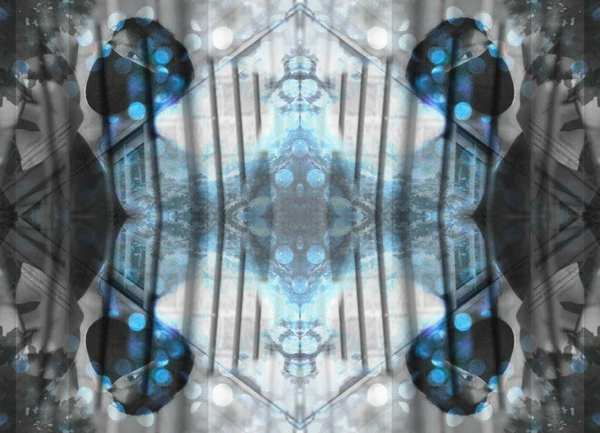
Multi exposure designIn this image, 3 images are used, the red building and the white building being in separate images. I like how they work together, but the editing could be improved. I would like to have the subject's shoulders visible under the buildings overlay, as this would add detail and interest to the image.
|
|
What is the aim of this shoot?
In this shoot I want to do another double exposure design, and some physical editing. I want to use images of paths and trees, put a portrait over them, use tracing paper to blur and obscure the images, and possibly burn parts of them too. |
|
|
|
What photographer and what technique do you want to combine for Composition 2:
I really like the work of Gemma Schiebe, which is done by placing tracing paper over the image and cutting select areas out. I plan to do this with my work. This is physical manipulation, which I am new to. The bright greens and blues within the images will be muted by tracing paper, and this will completely change the feel of the composition. |
|

|

|

|

|
|


|
|
|

|
|